Brand Strategy Naming & Identity Brand Development Art Direction Brand Imagery Print & Digital Media Website Signage & Advertising
PROJECT OVERVIEW
Verso Projects was founded with a clear objective — to create a brand that not only stood out in Brisbane but became an integral part of its evolving story. More than just a property developer, their vision was to help shape the city’s future, taking on rare, complex sites with ambition and originality. By attracting top talent, their goal was to build high-profile joint ventures and establish a new legacy of excellence. As a result, Verso positioned itself as a prominent leader, inspiring consultants, planners, local businesses and buyers with a message of originality, diversity and uncompromising quality.
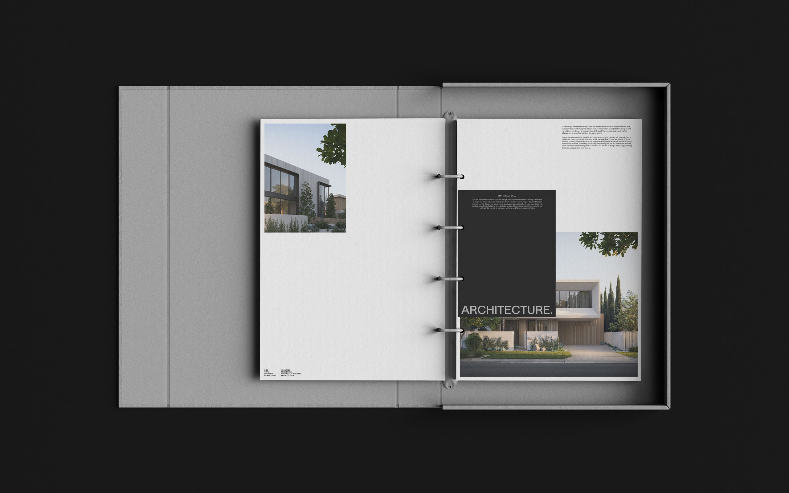
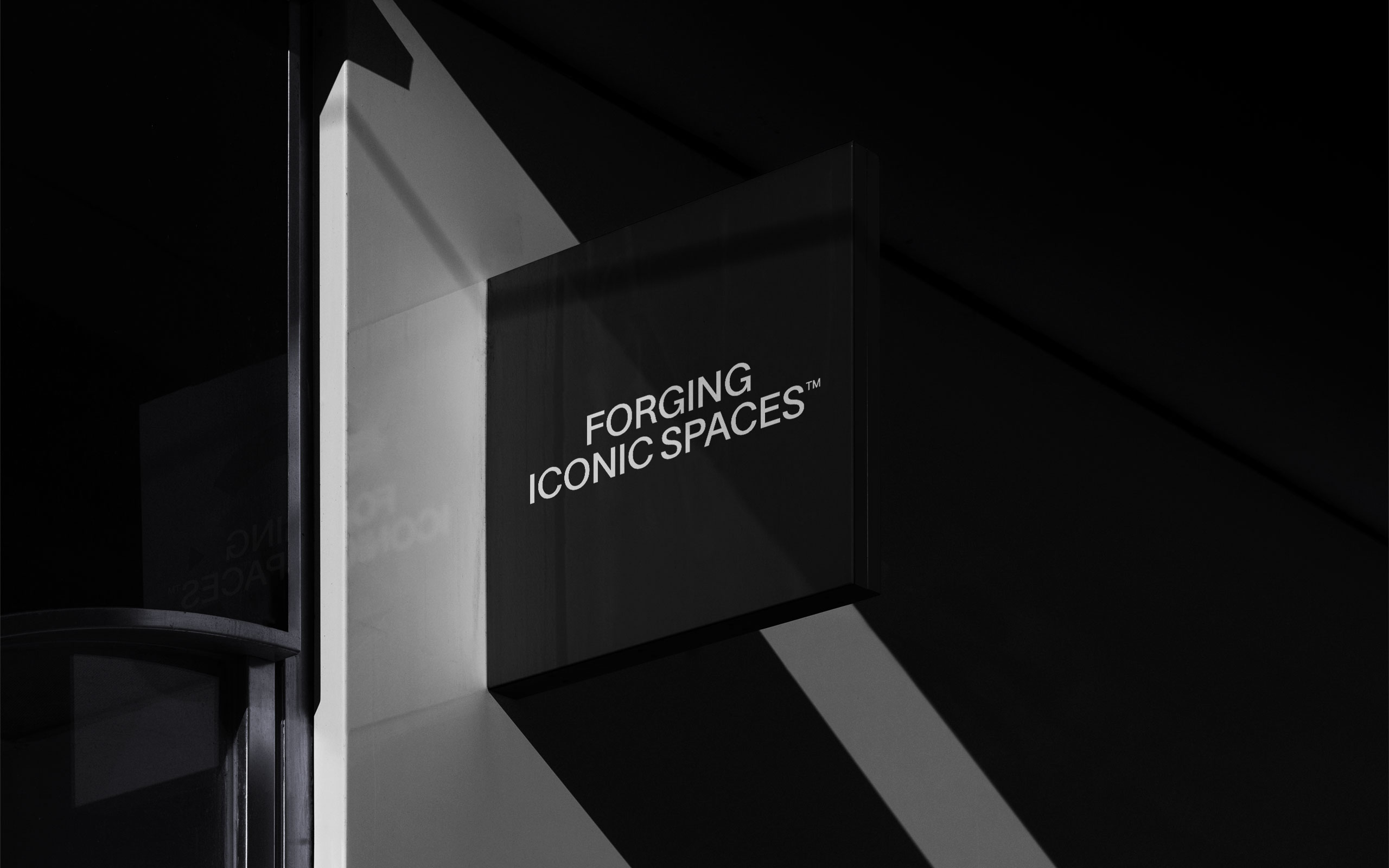
The name reflected a fresh start — turning the leaf toward new perspectives and fearless ideas. This philosophy was embodied in the brand’s ethos, “Forging Iconic Spaces,” highlighting their ability to create transformative projects across sectors while maintaining a distinct identity. Grounded in four key pillars — Materiality, Architecture, Space and Surrounds — these elements were carefully formulated to serve as a blueprint, shaping every project with intent and ensuring each development is crafted to endure, leaving a lasting imprint on the city’s landscape.
BRAND DEVELOPMENT
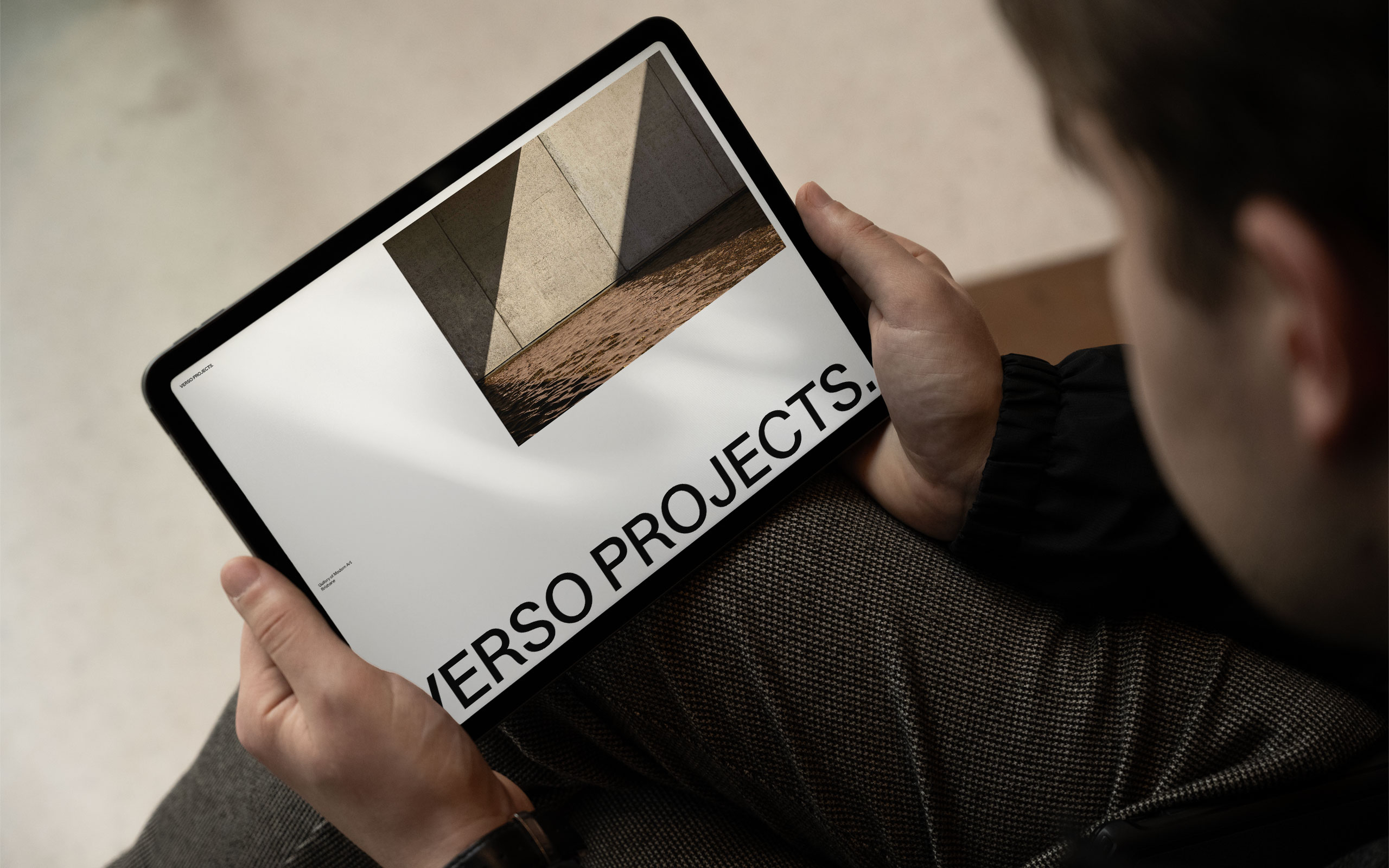
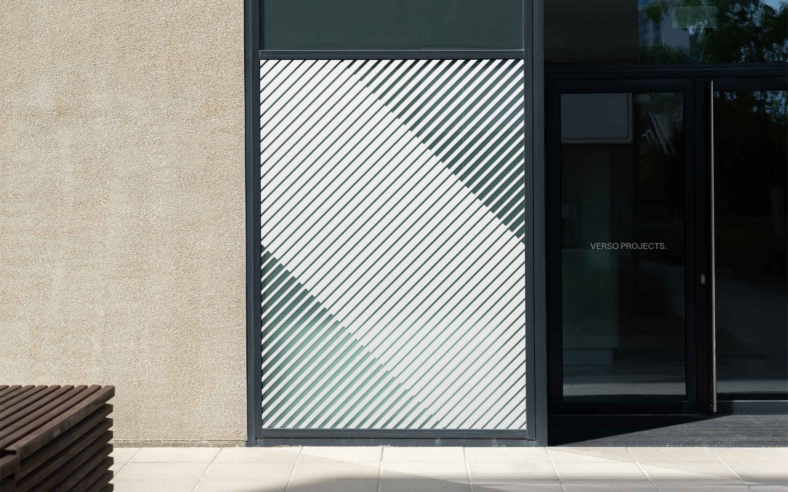
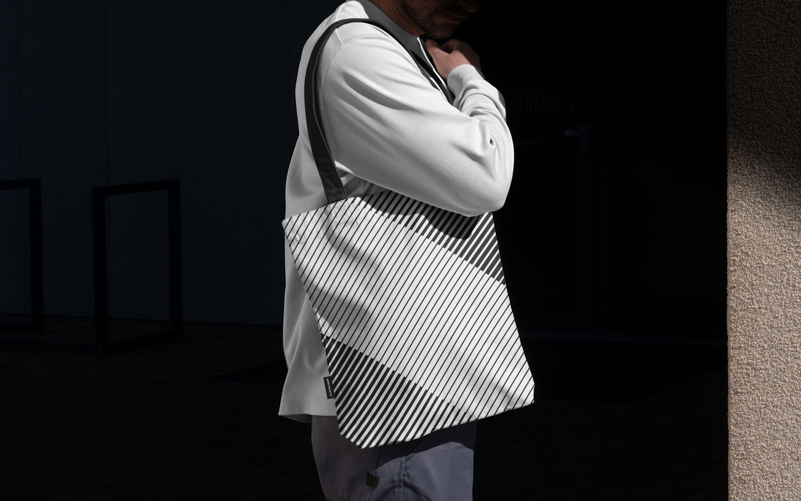
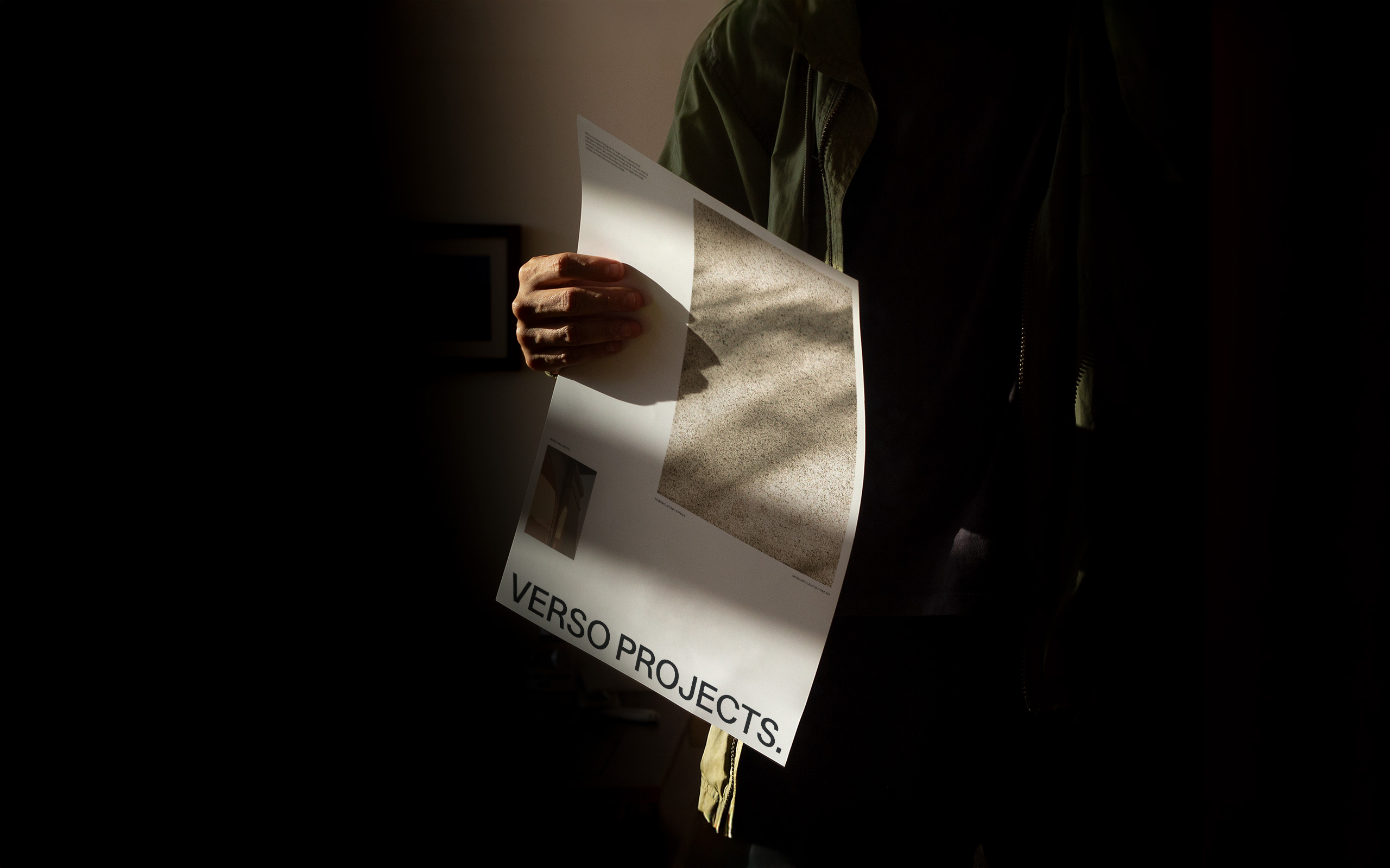
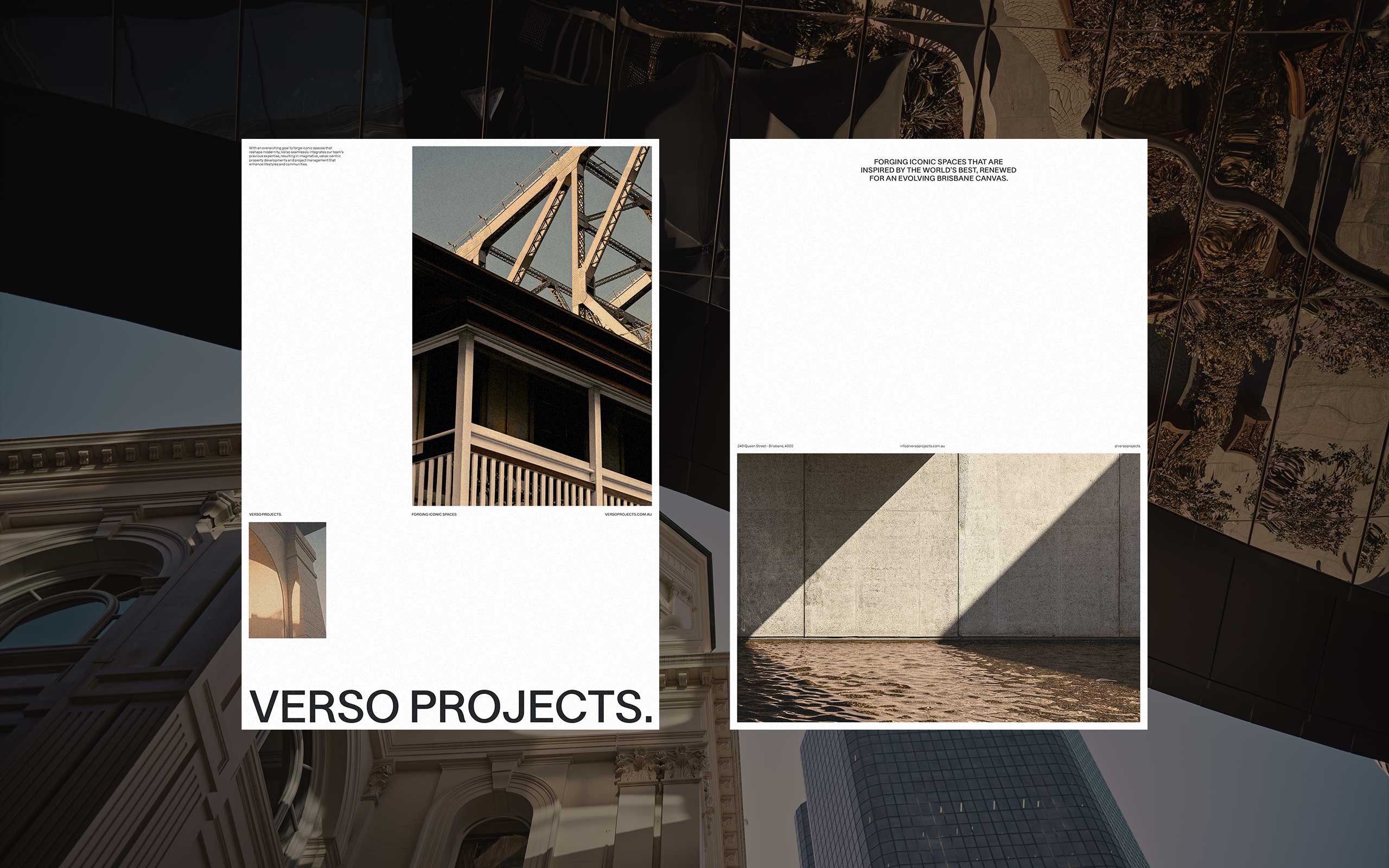
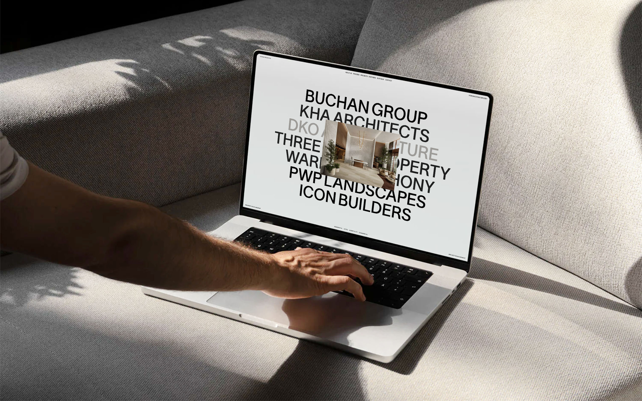
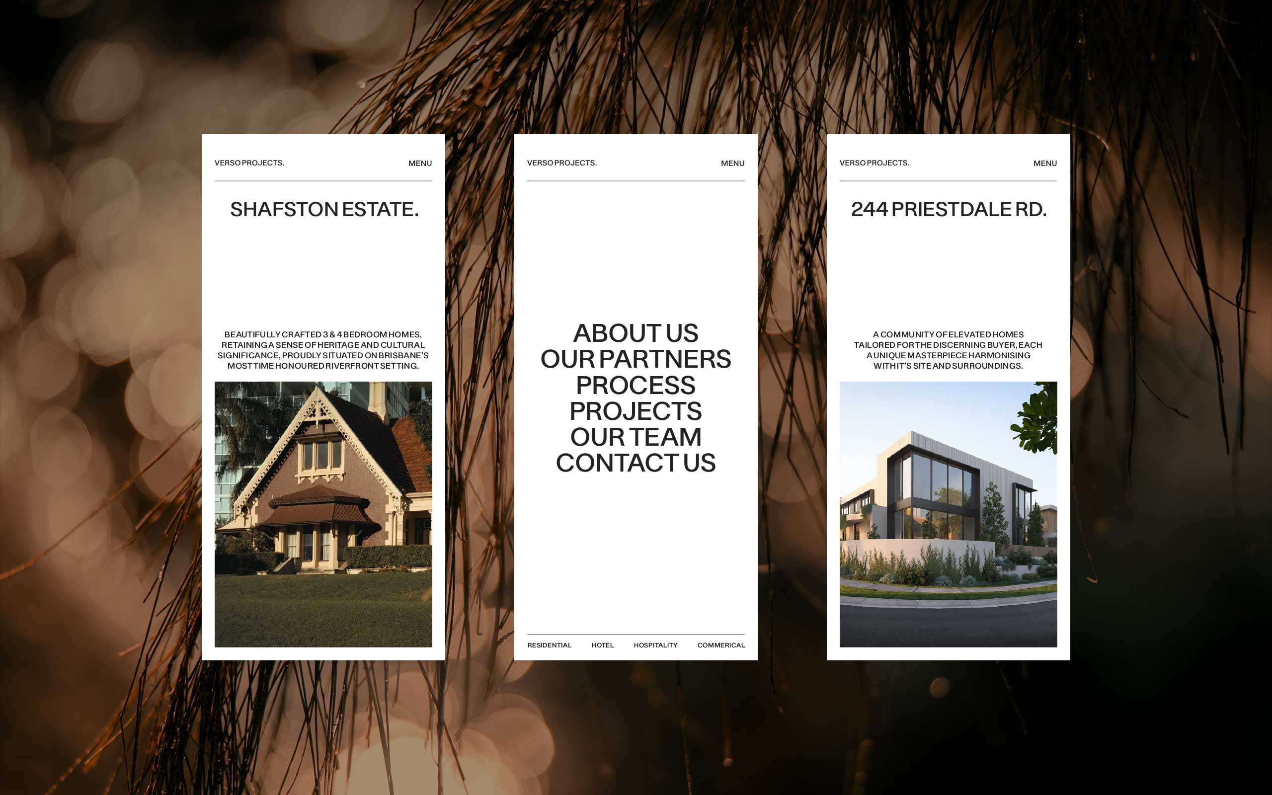
Our creative direction focused on a modular, grid-based design system that allowed for flexibility in presenting both minimal and detailed information. This structure was intentionally crafted to adapt to various content needs while ensuring visual consistency across all brand materials. It embodied the philosophy of Forging Iconic Spaces by merging precision with fluidity, representing the seamless integration of elements that define Verso’s projects.
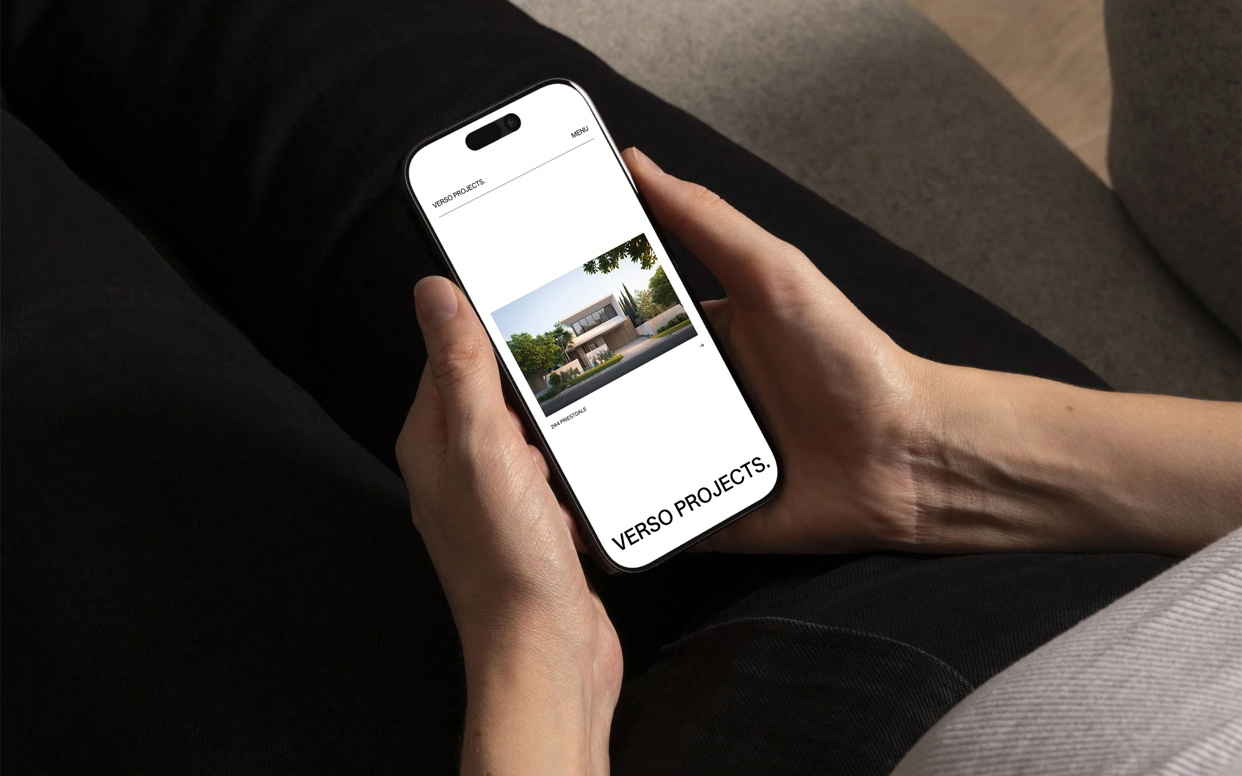
The brand’s identity was further enhanced by a minimalist, yet impactful logo, designed to integrate effortlessly with motion. The wordmark’s clean, legible design ensured clarity across different mediums, while dynamic motion graphics brought the brand to life. This approach not only reinforced Verso’s commitment to innovation but also established a new standard for how its visual language communicated the brand’s core values — creating spaces that are both iconic and transformative.
ART DIRECTION
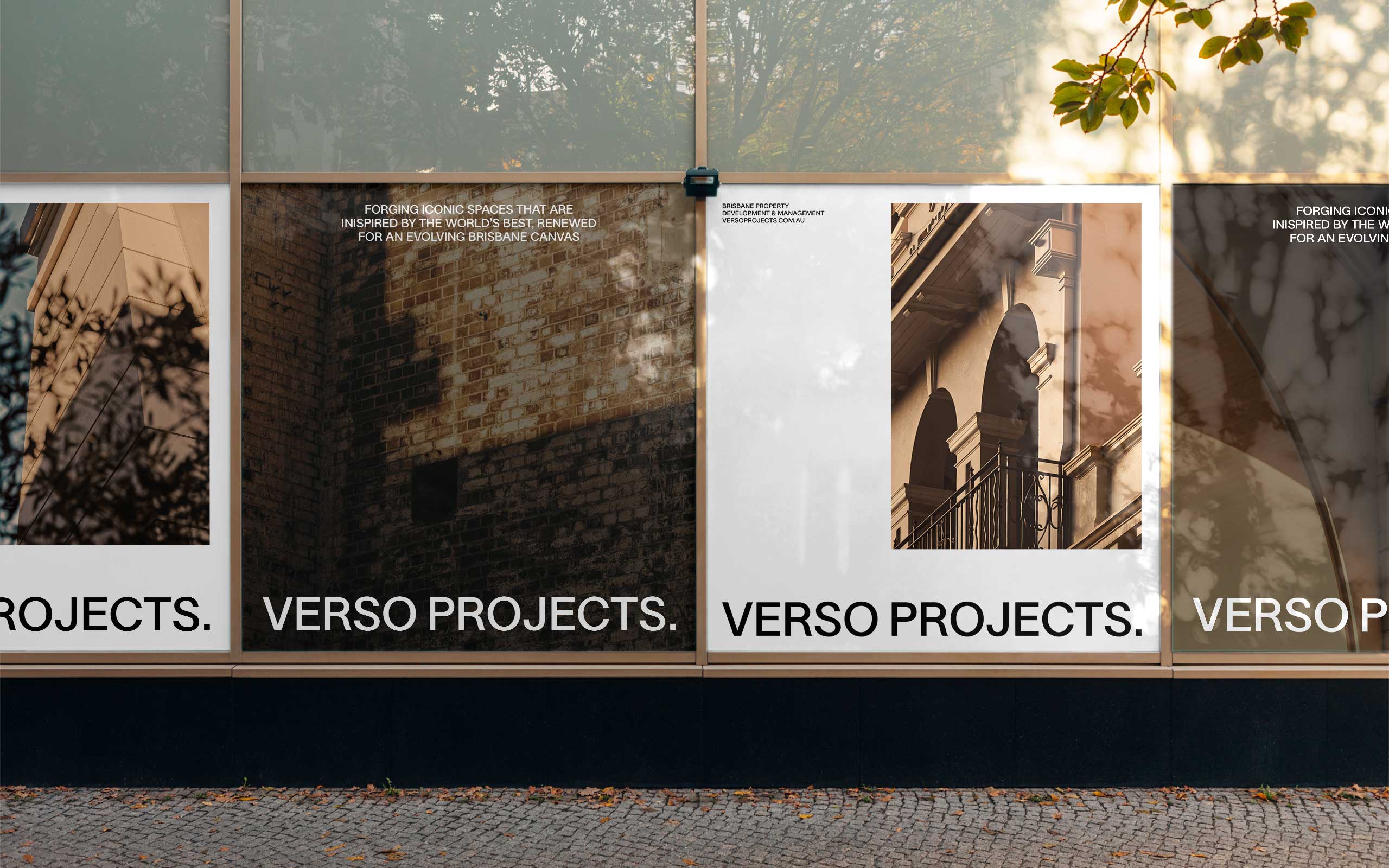
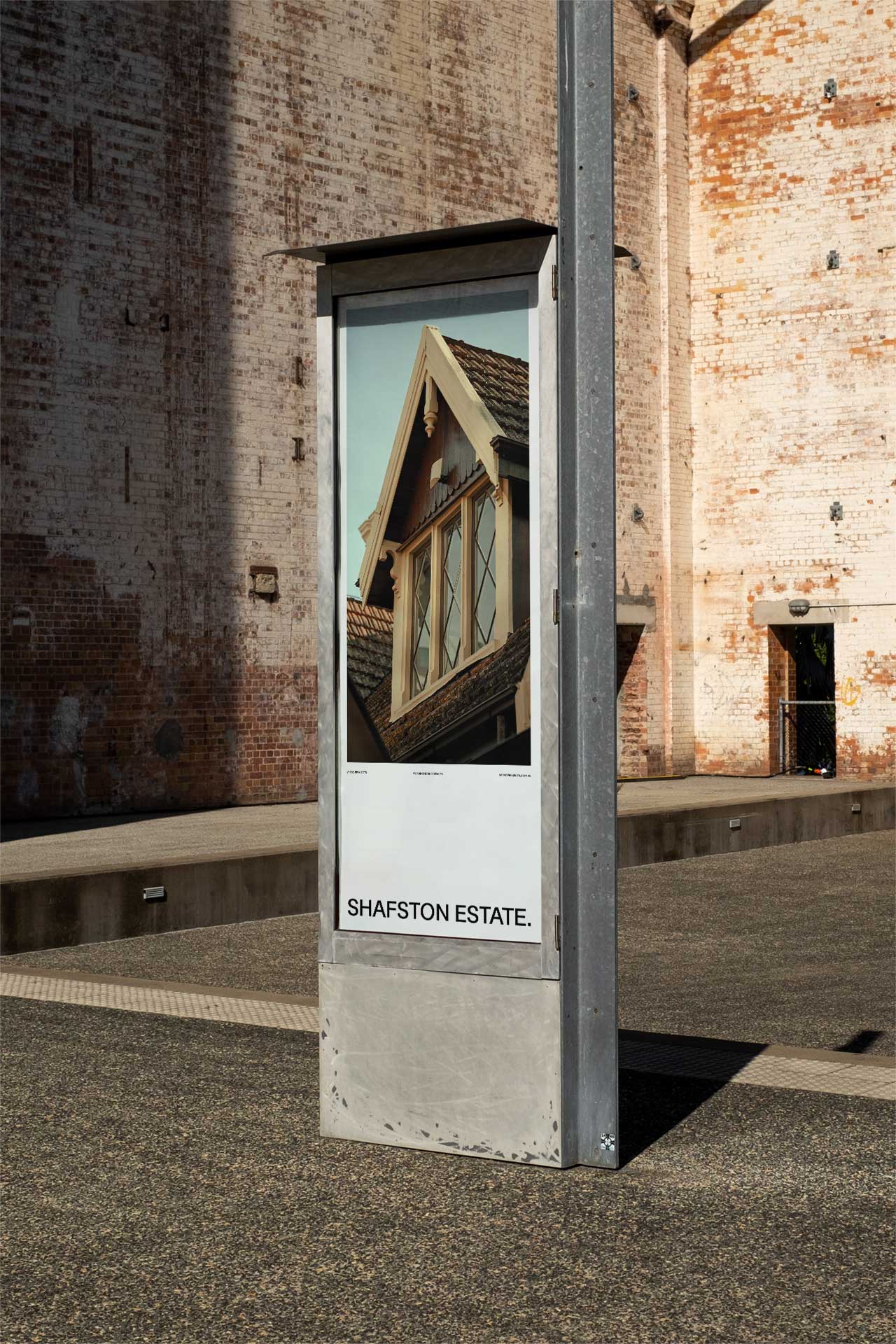
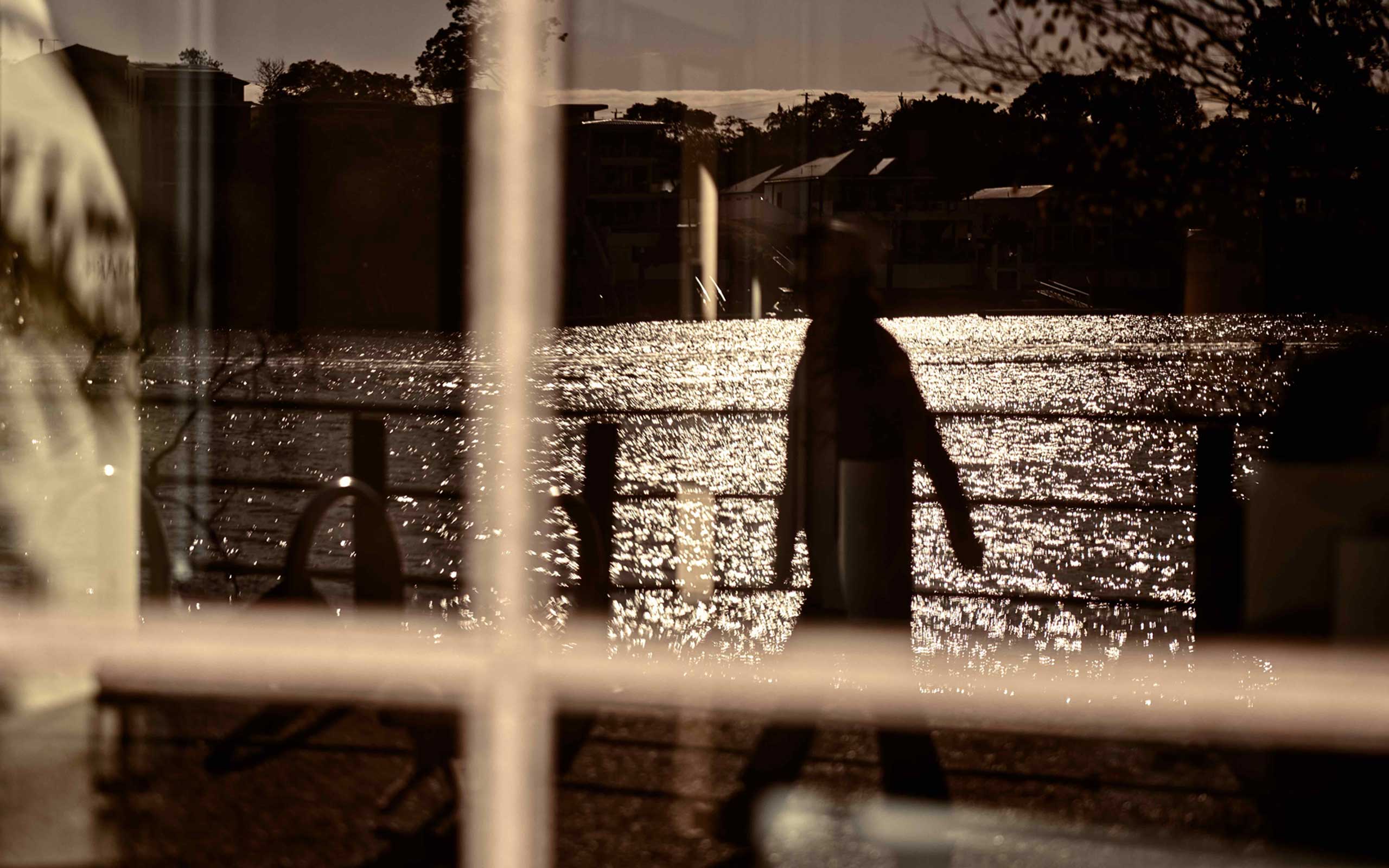
In collaboration once more with renowned photographer Paul Giggle, we aimed to create a visual identity that captured Brisbane’s unique character. The goal was to showcase the city’s vibrancy while reinforcing Verso’s deep appreciation for the natural landscape. The collection combined sweeping landscapes with intricate architectural details, emphasising the harmony between urban and natural elements. To highlight the city’s atmosphere, the photography focused on the warm, golden hues that define Brisbane’s cityscape.
This curated visual narrative extended Verso’s brand identity beyond just architecture, embracing a broader cultural appreciation of place. By blending architectural precision with environmental beauty, the imagery reflected Verso’s philosophy of thoughtful, context-driven design. The result was a compelling representation of the brand’s vision, creating a deeper connection with the city and its evolving landscape.