Brand Strategy Brand Repositioning Identity & Development Art Direction Print & Digital Media Website Marketing Collateral
PROJECT OVERVIEW
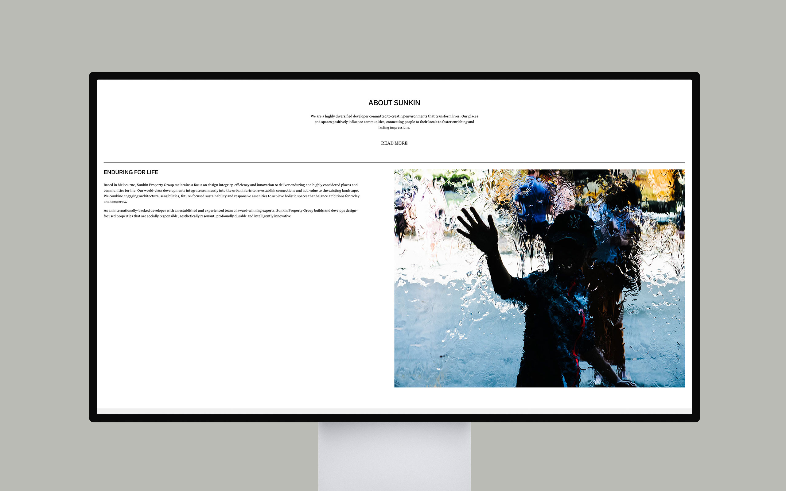
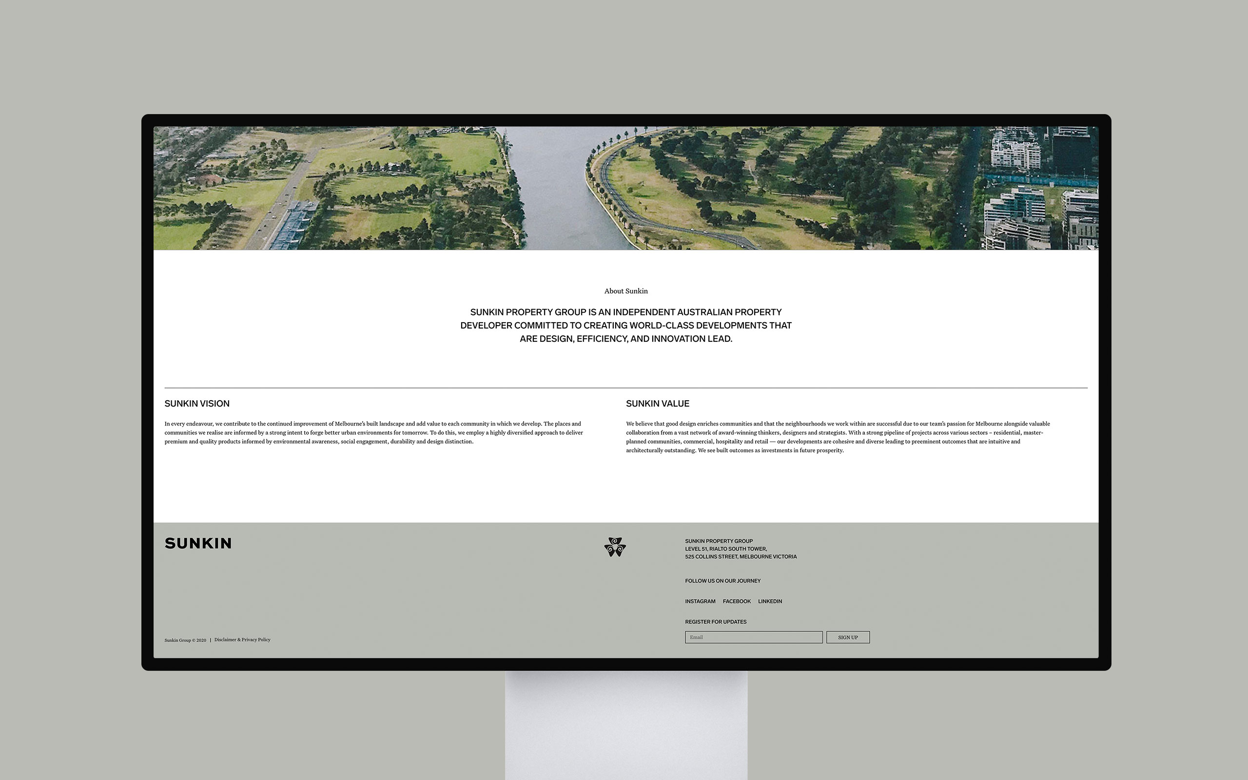
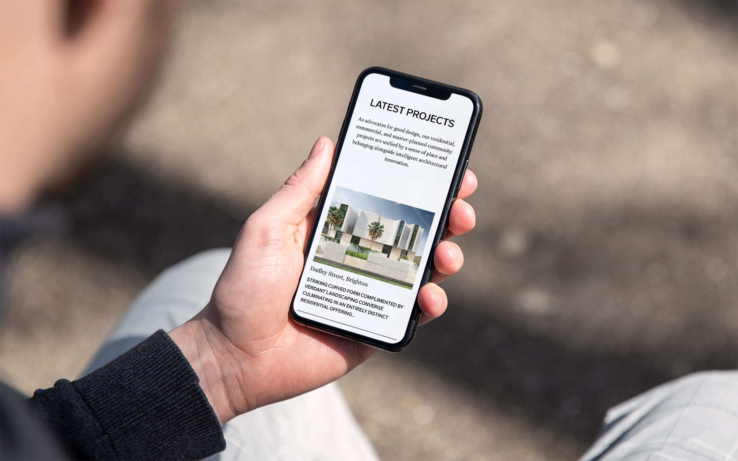
Seeking to expand its presence in Australia, the internationally successful developer, Sunkin Group, recognised the need for a new brand that embodies its local expertise and forward-looking vision. Through collaborative workshops with the Sunkin team, we devised a strategy to emphasise their unwavering dedication to crafting environments that consistently enrich work, home, and community experiences.
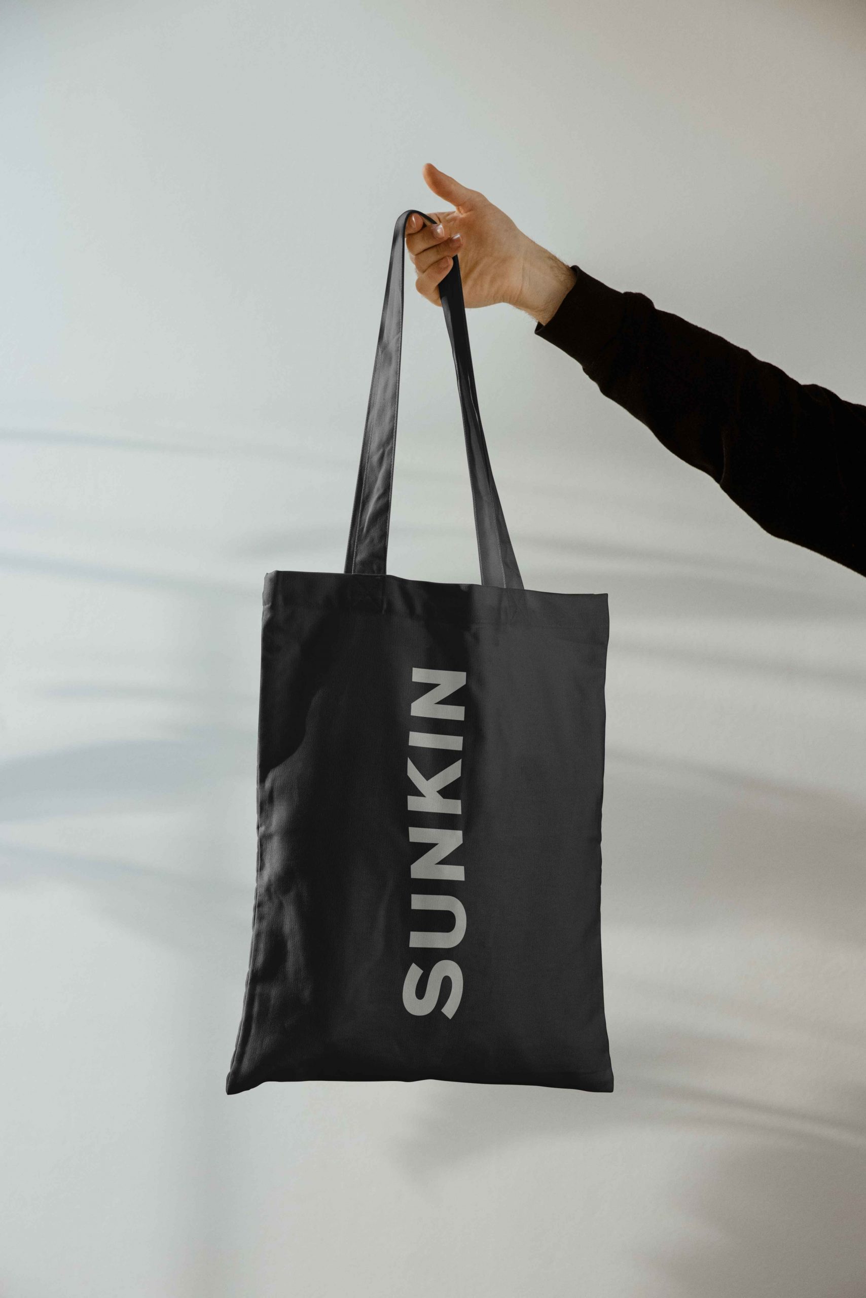
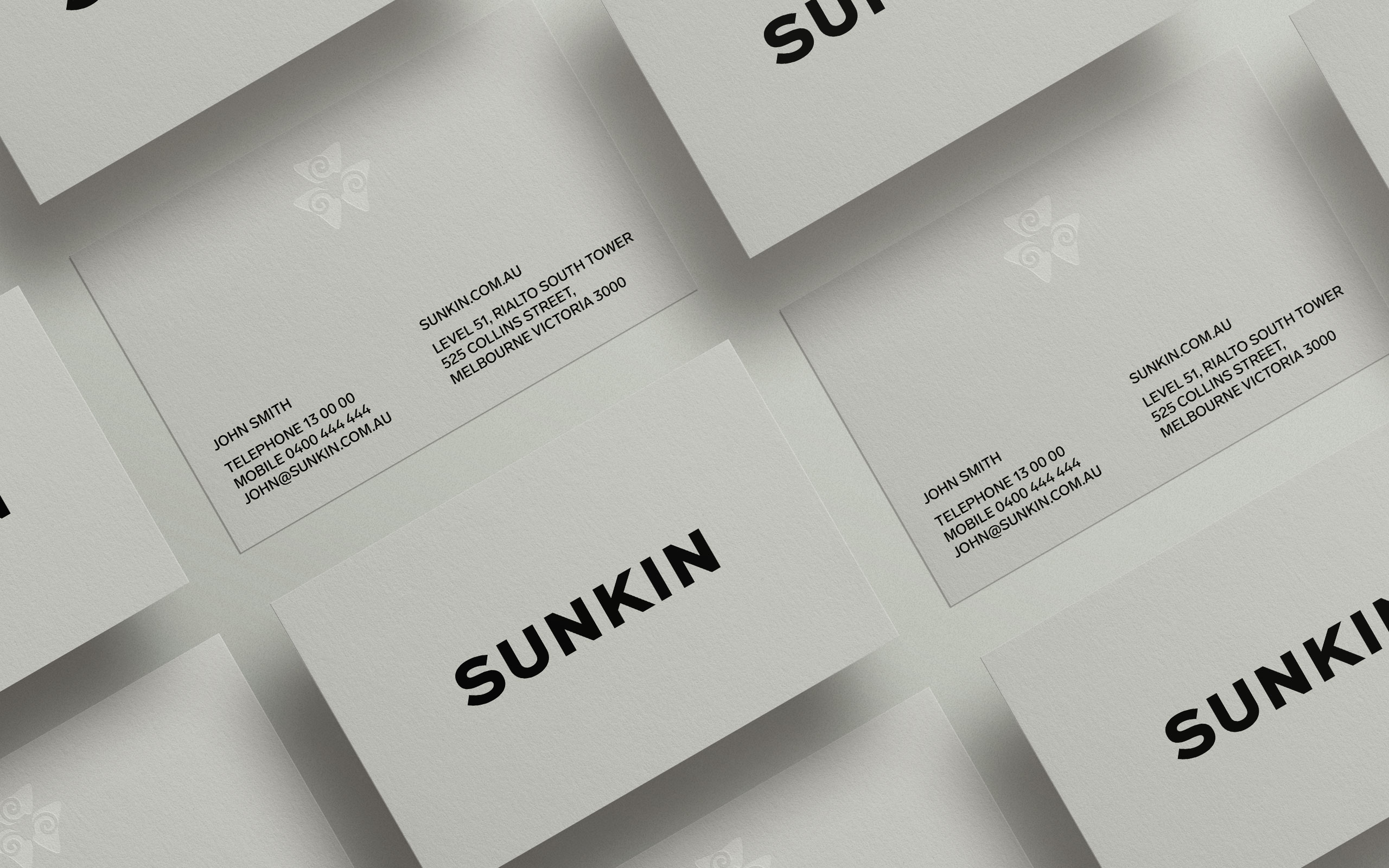
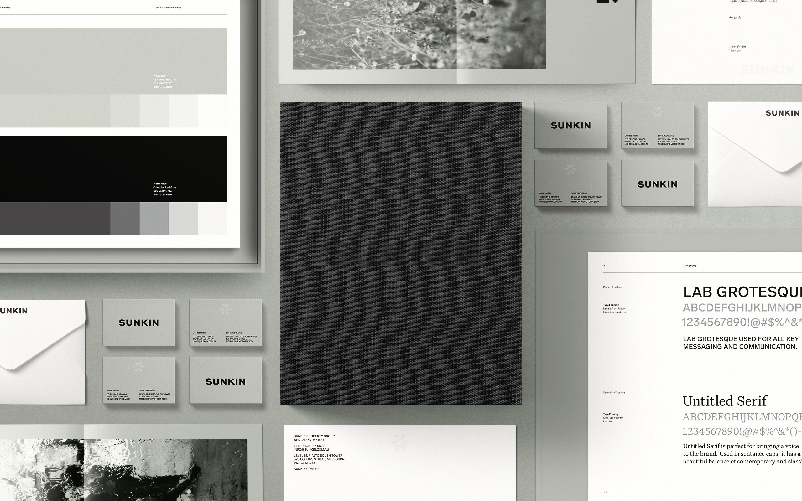
The branding transformation involved streamlining the name to Sunkin, and simplifying the parent brand’s flower motif. The outcome is a compelling, modern design that exudes strength and clarity. This revitalised brand strategy, combined with its creative implementation, has effectively repositioned Sunkin within a competitive market, equipping its team to confidently articulate the company’s narrative with utmost clarity and conviction.
BRAND DEVELOPMENT
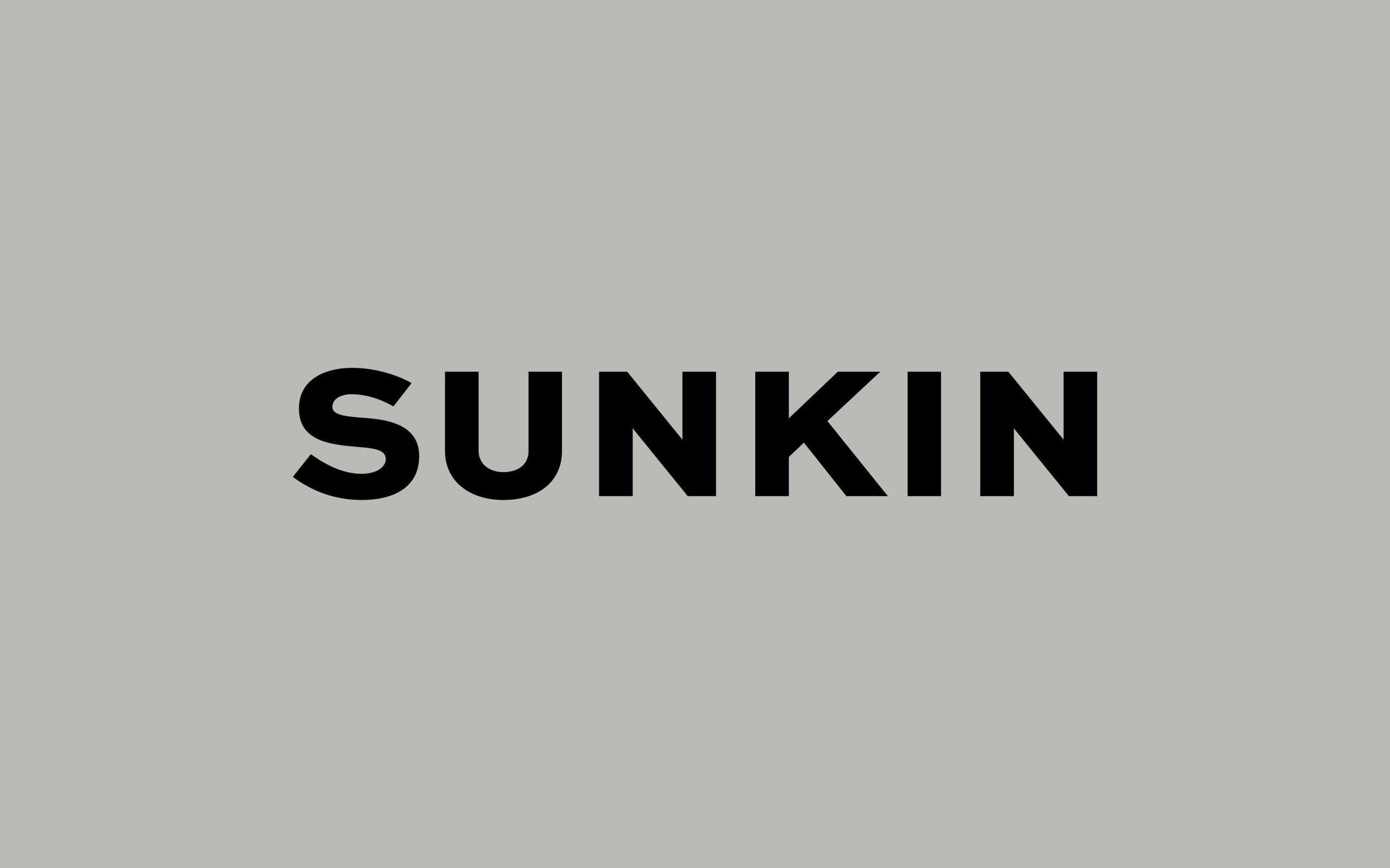
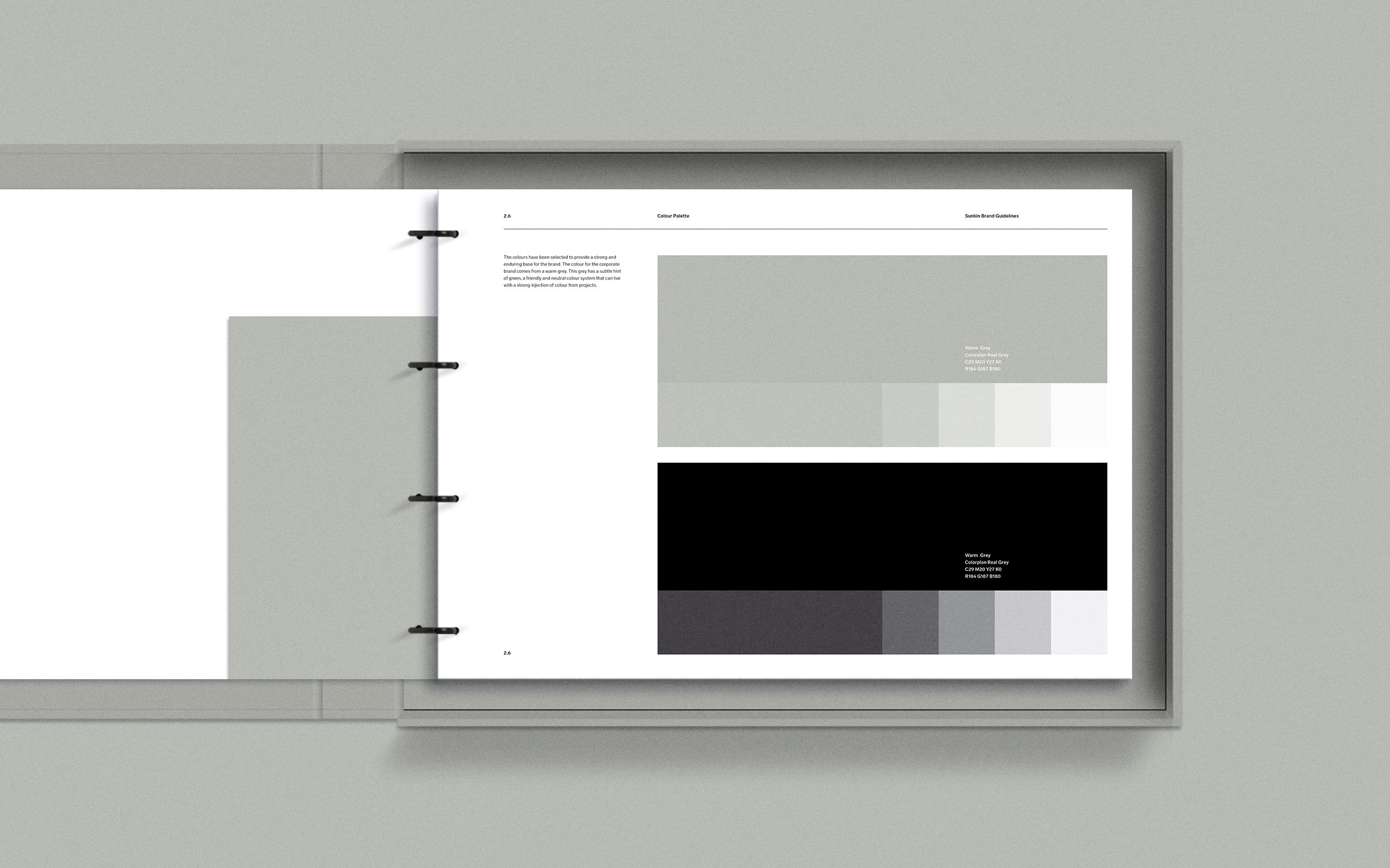
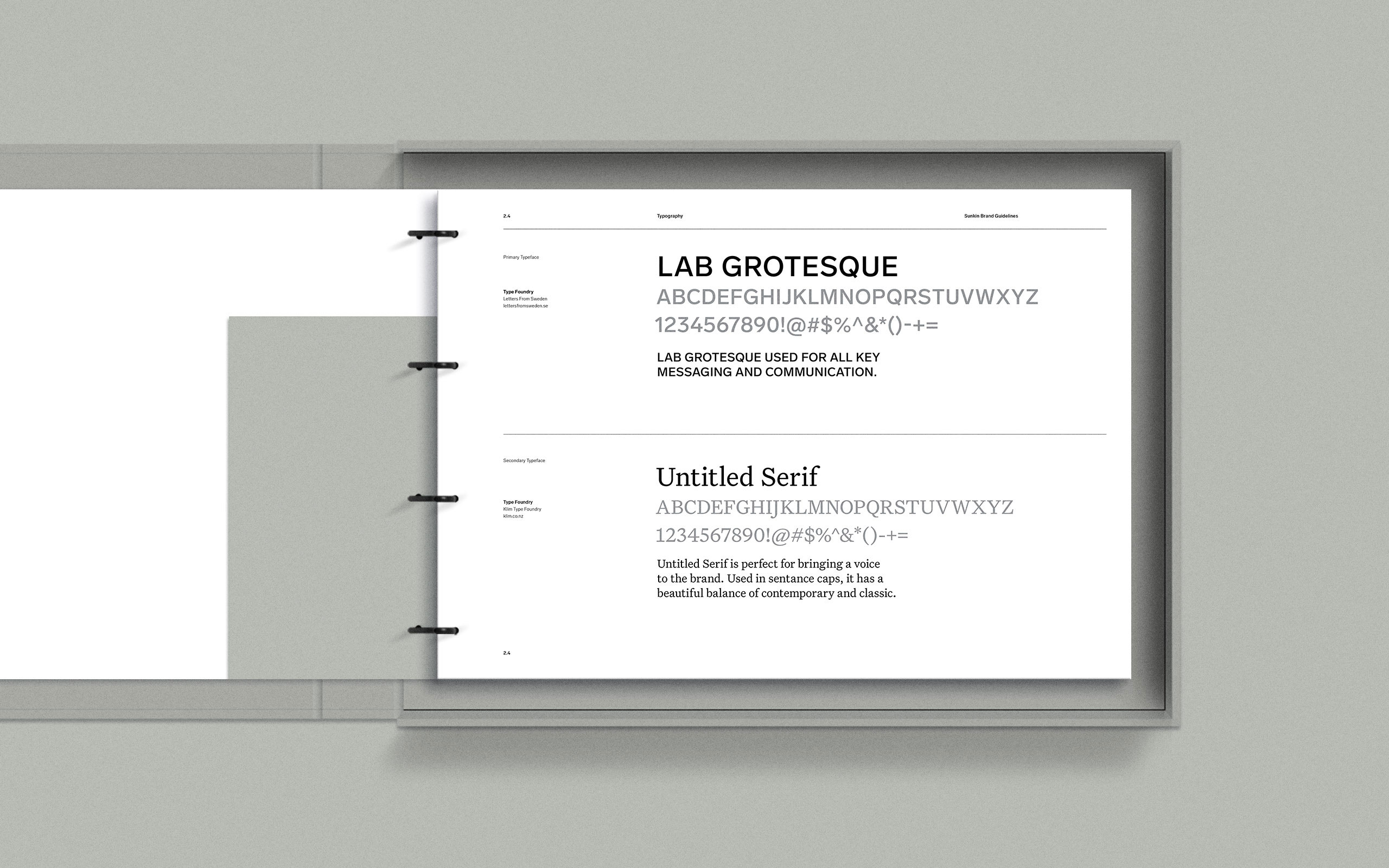
In a fiercely competitive market, the ability to be unique was crucial. We were seeking to leverage Sunkin’s history and create a distinctive brand system that not only brought a point of difference but was also timeless in its appeal. In this endeavour, we aimed to retain the existing brand icon, pairing it with a new, stronger sans-serif typeface. The chosen typeface was based on a classic sans-serif style, ensuring a logotype that was robust and enduring.
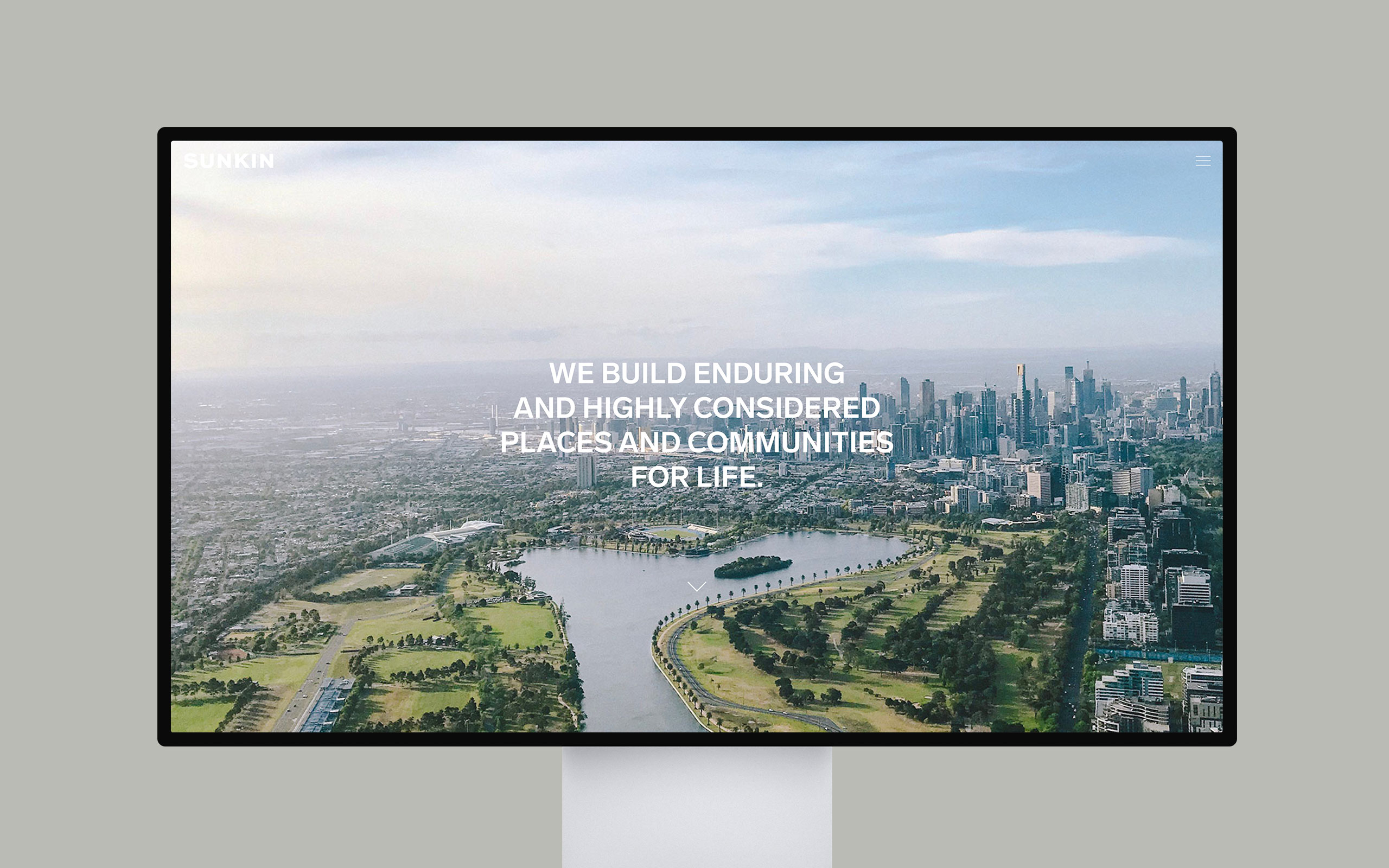
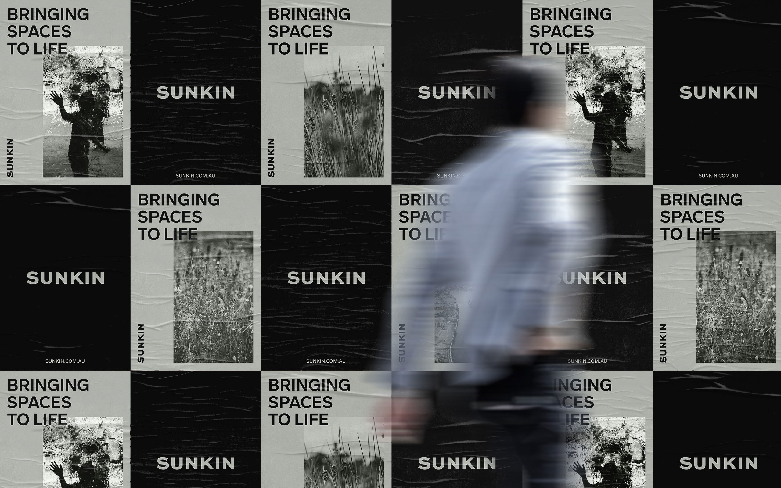
The logotype had been carefully designed to introduce Sunkin to the Australian market with a brave, engaging, and well-considered visual presence. The intention was to provide a brand that could adapt to the evolution of Sunkin’s offerings in Australia — a brand with a clear and meaningful purpose.
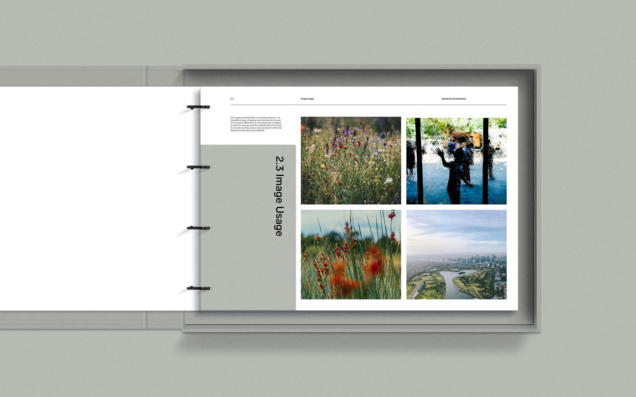
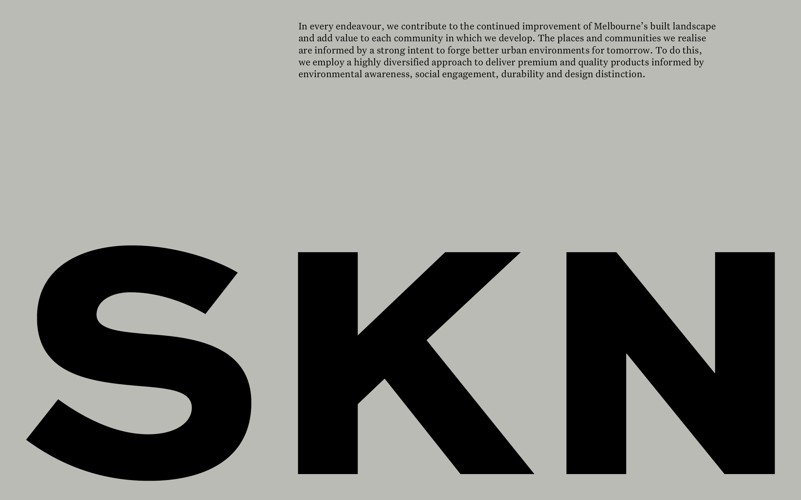
connecting people to their locale to foster enriching and lasting impressions