Brand Strategy Brand Identity Art Direction Brand Imagery Brand Guidelines Digital Media Website Campaign
PROJECT OVERVIEW
Partnering once again with one of Grenade’s longest-standing clients, SMA engaged us to reimagine their brand for a new era of growth. Historically, SMA had relied on a loyal base of repeat investors and contacts from previous project databases. But as the business set its sights on broader markets, it became clear the brand needed to evolve — visually and strategically. The brief called for more than just a cosmetic refresh: we needed to elevate the brand’s presence, unify its identity, and create a robust communication platform from which to launch future developments. Importantly, SMA wanted to retain the brand equity we had built together over time. Our approach, therefore, was evolutionary, not revolutionary.
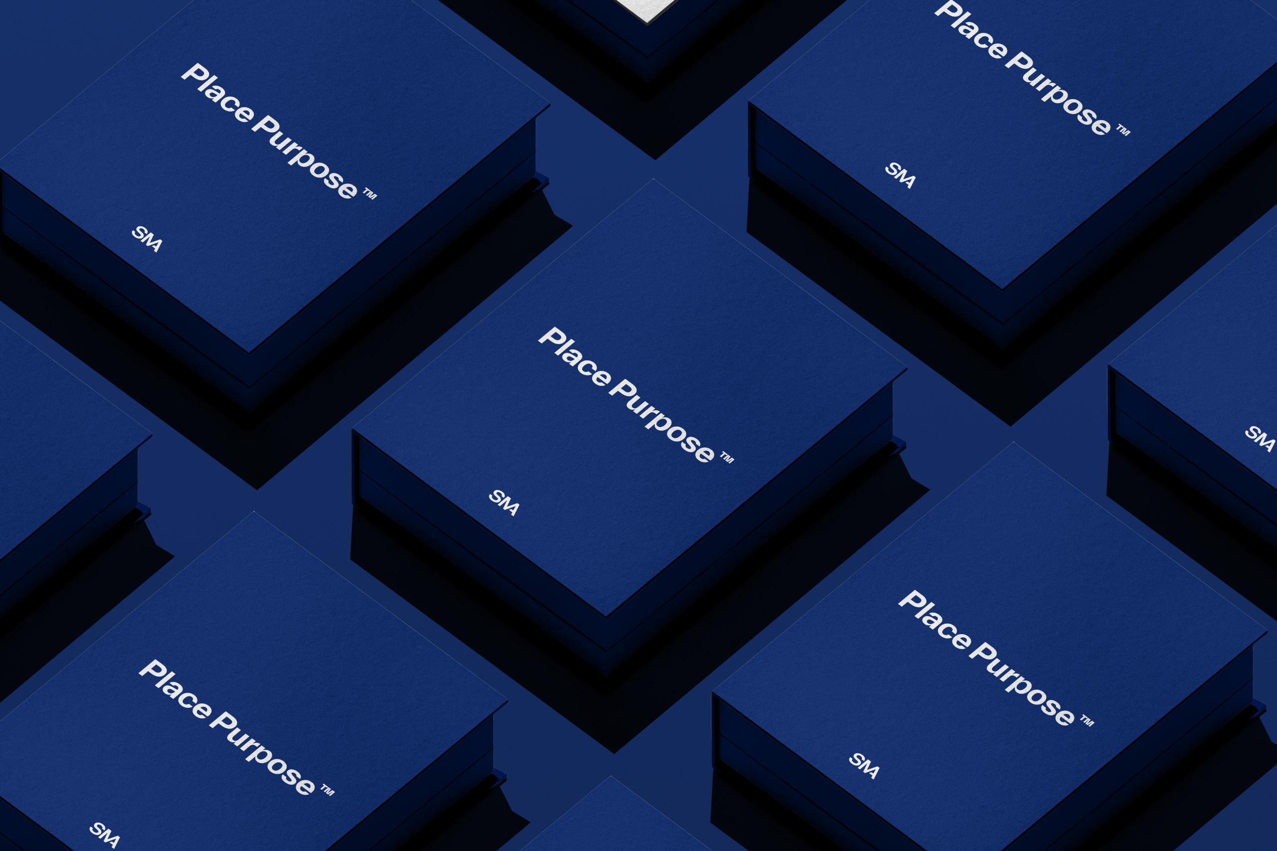
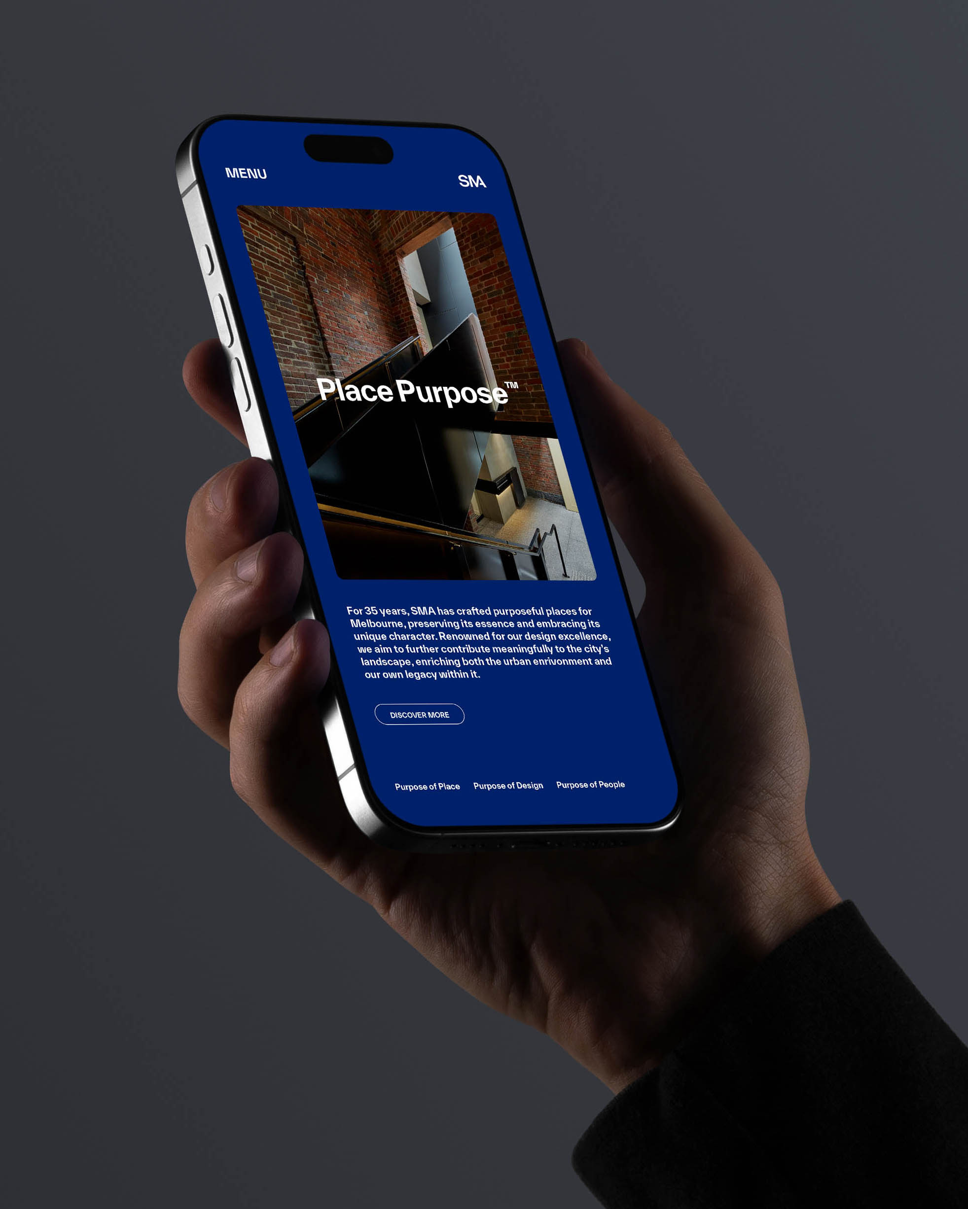
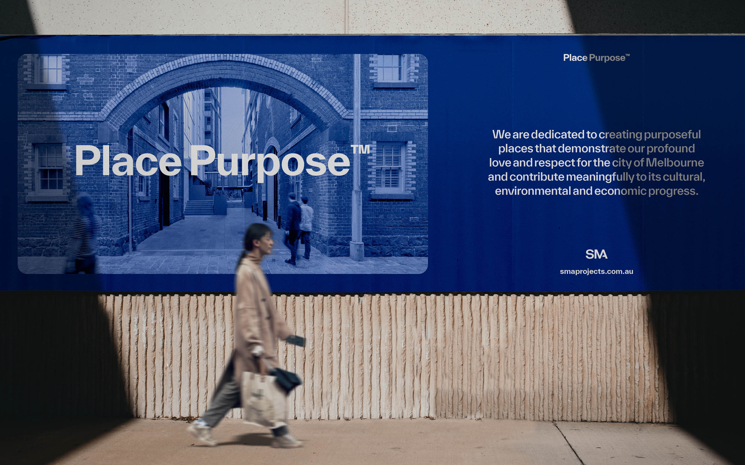
For 35 years, SMA has crafted purposeful places for Melbourne, preserving its essence and embracing its unique character, so we began by developing a new master-line that anchors the brand’s positioning and reflects their ethos. Place Purpose. This speaks to SMA’s deep connection and dedication to Melbourne. To respecting and transforming heritage sites and their ongoing commitment to thoughtful, meaningful development. The result is a brand that honours its legacy while signalling a clear intent for the future: stronger, bolder and ready for a wider stage.
BRAND DEVELOPMENT
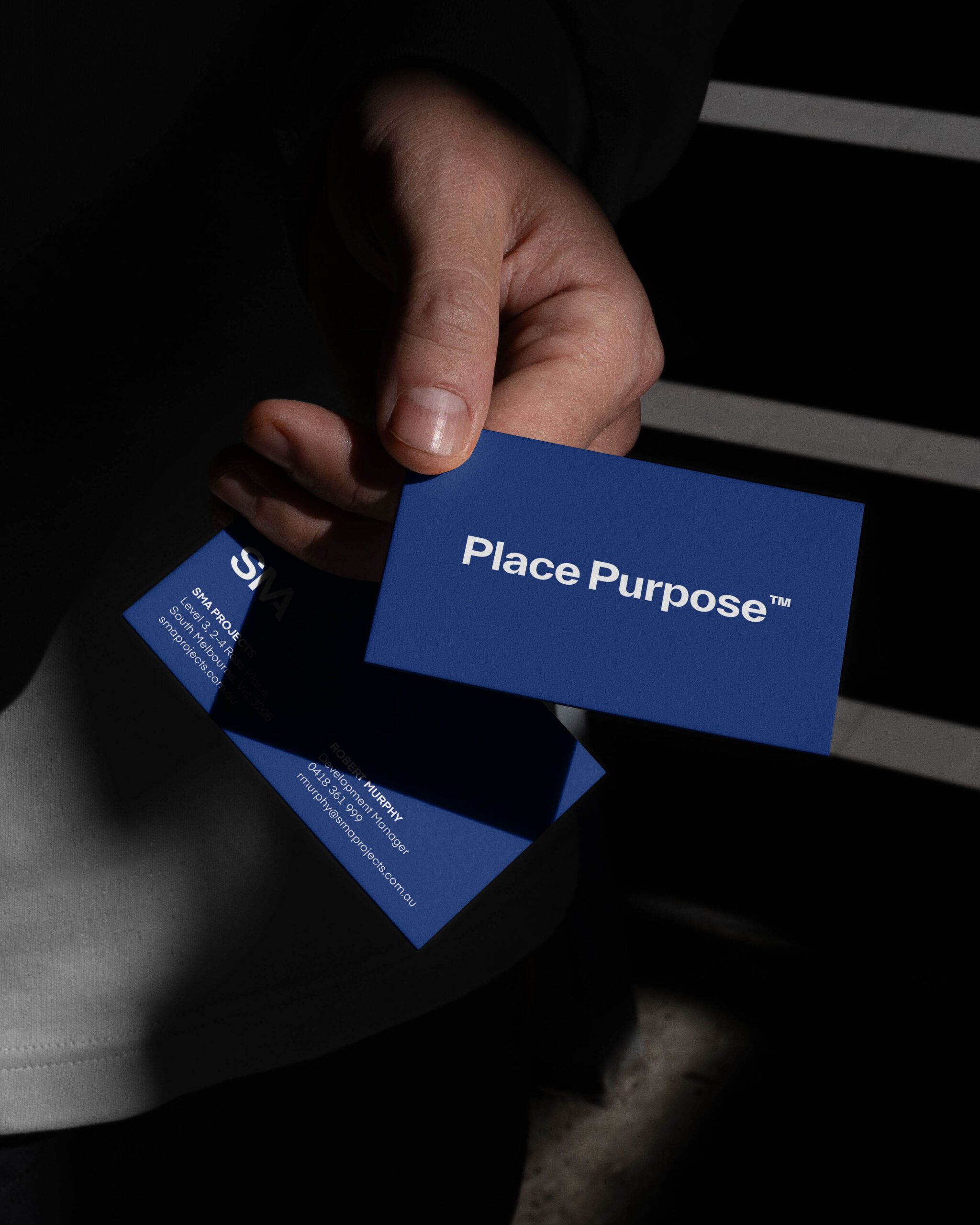
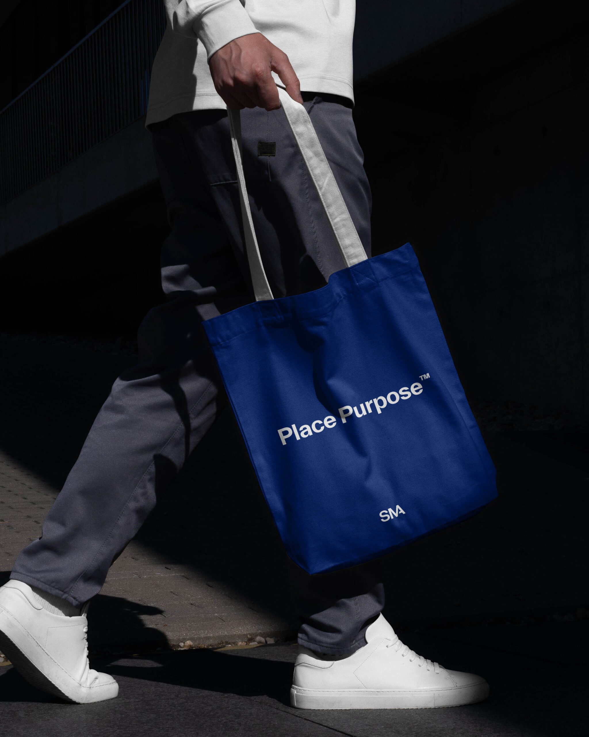
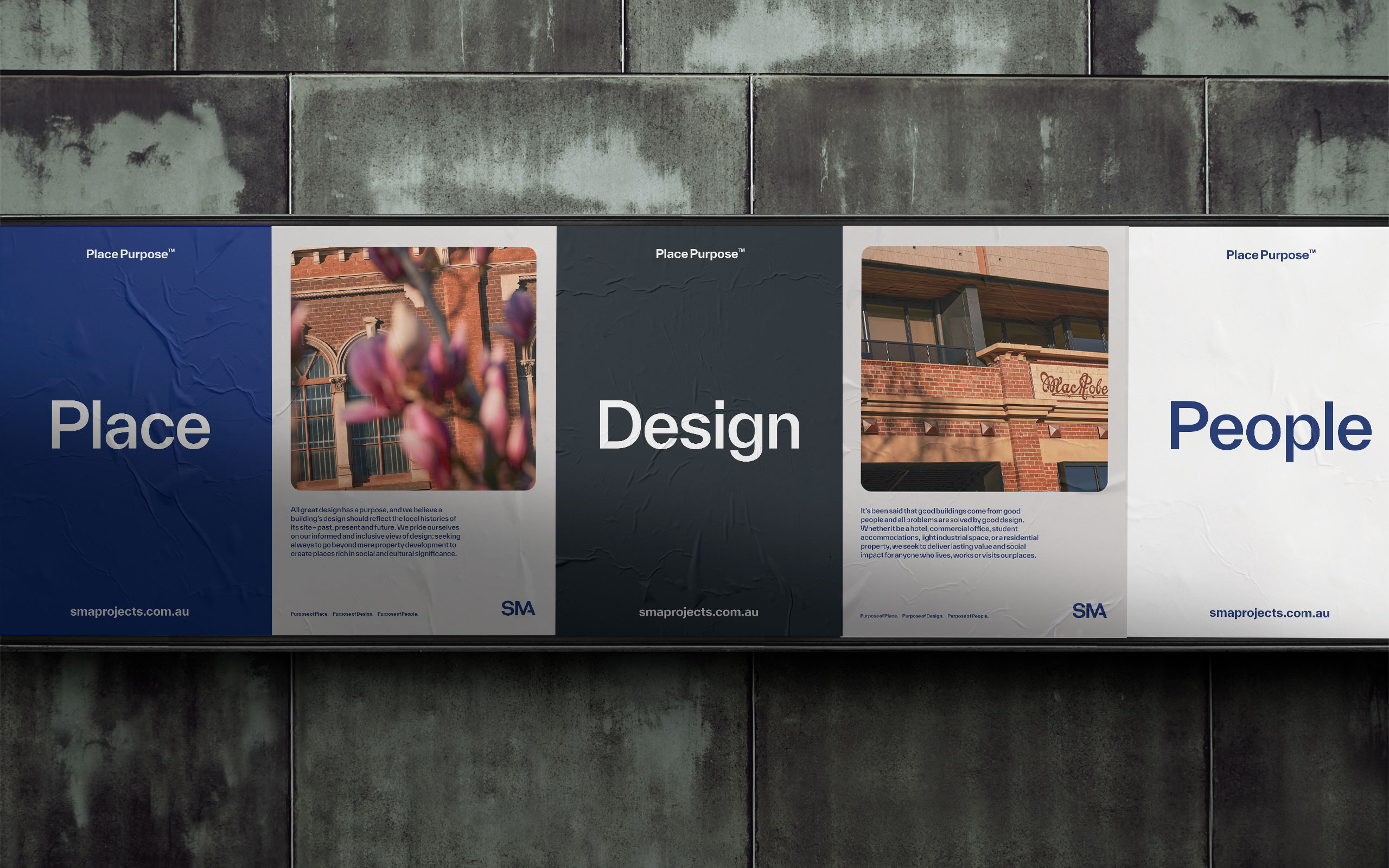
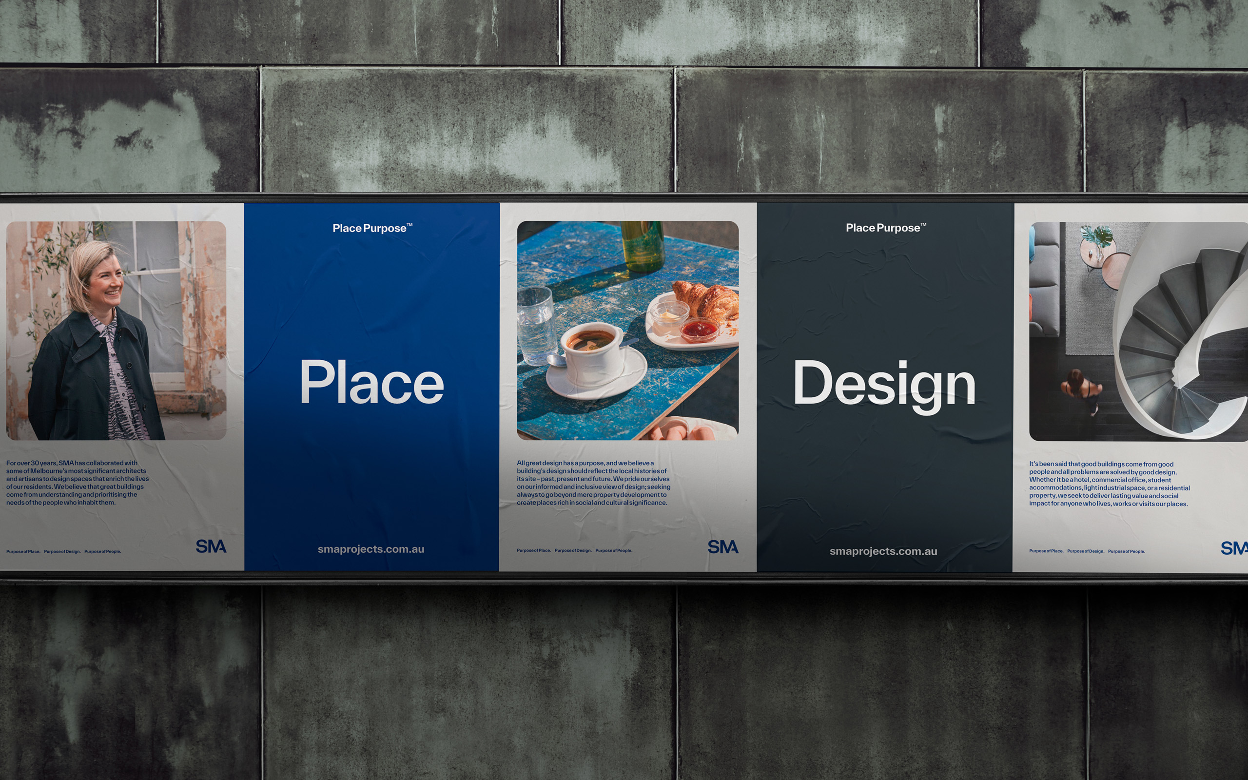
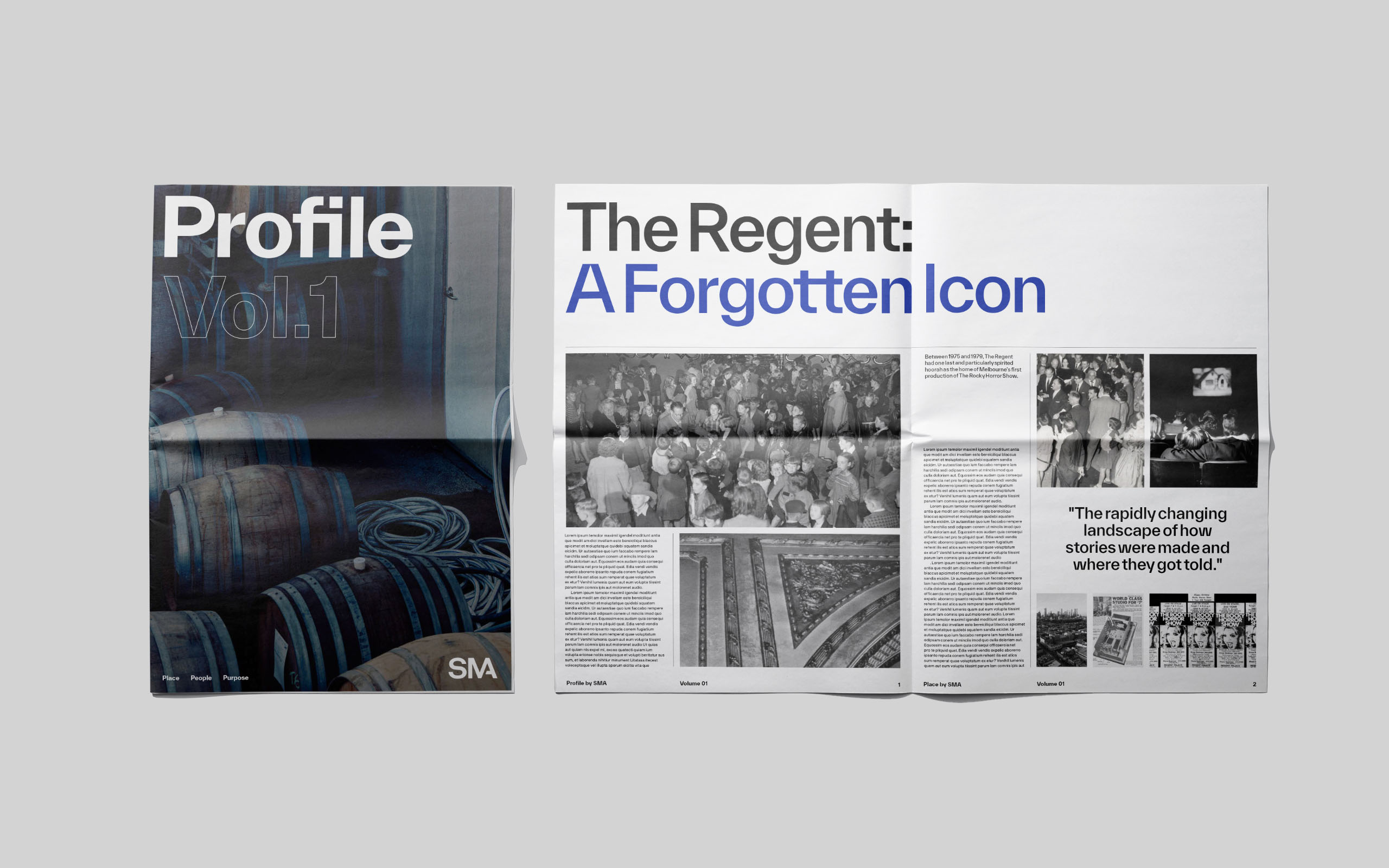
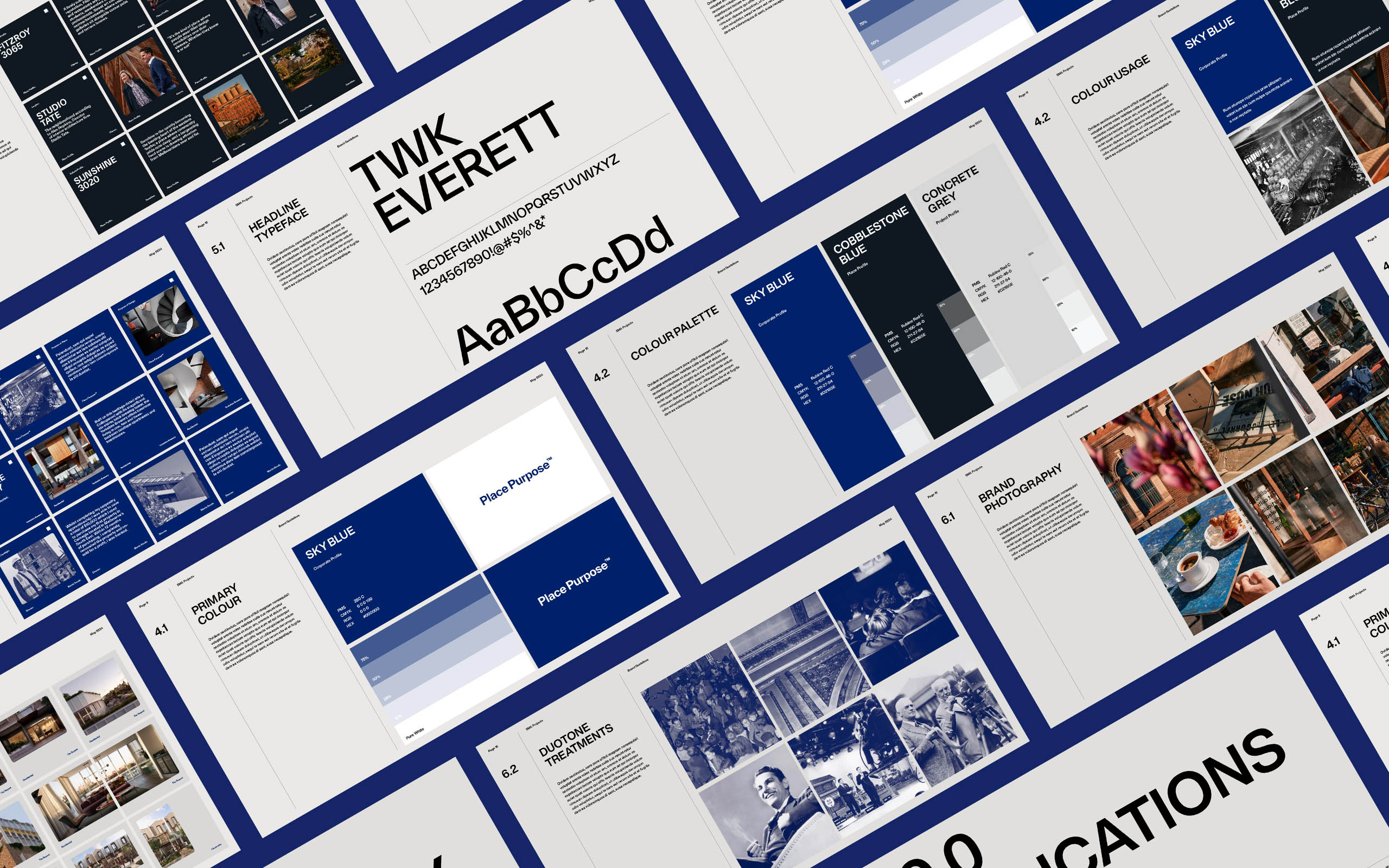
The SMA rebrand began with a confident evolution of its visual identity. We introduced a bold new blue — building on their original corporate palette — supported by a refined system of complementary tones. This refreshed colour strategy, paired with updated typography and layout systems, created a more contemporary and cohesive design language.
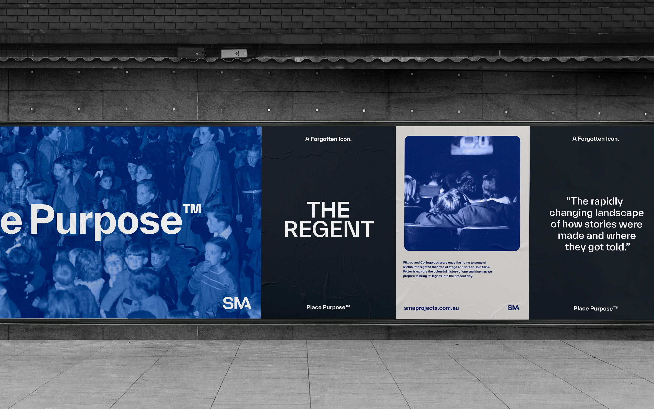
With major projects about to launch, we saw an opportunity to tease them out under the new SMA brand — positioning the developer more prominently in the market. This shift was supported by a targeted rollout across key brand touchpoints.
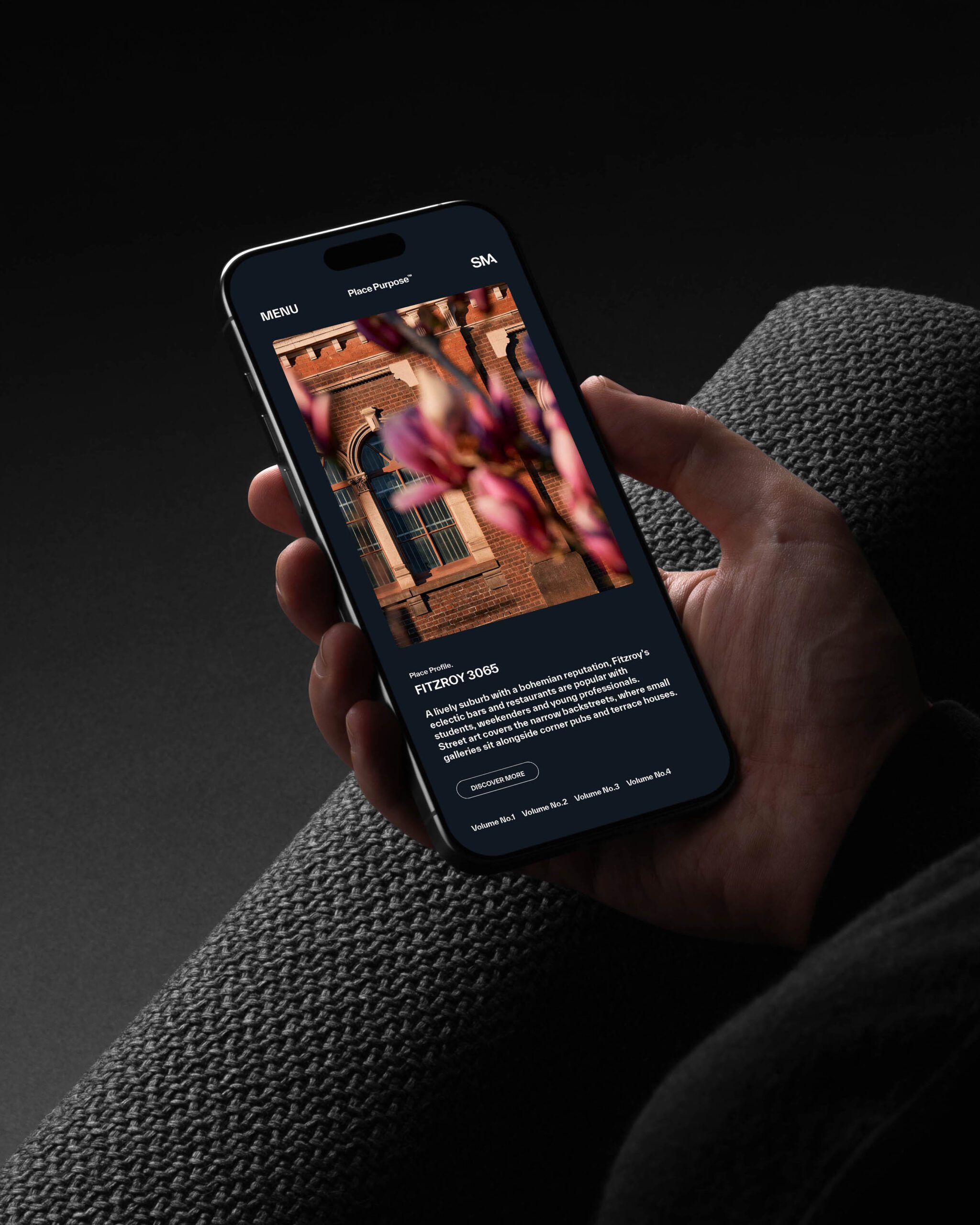
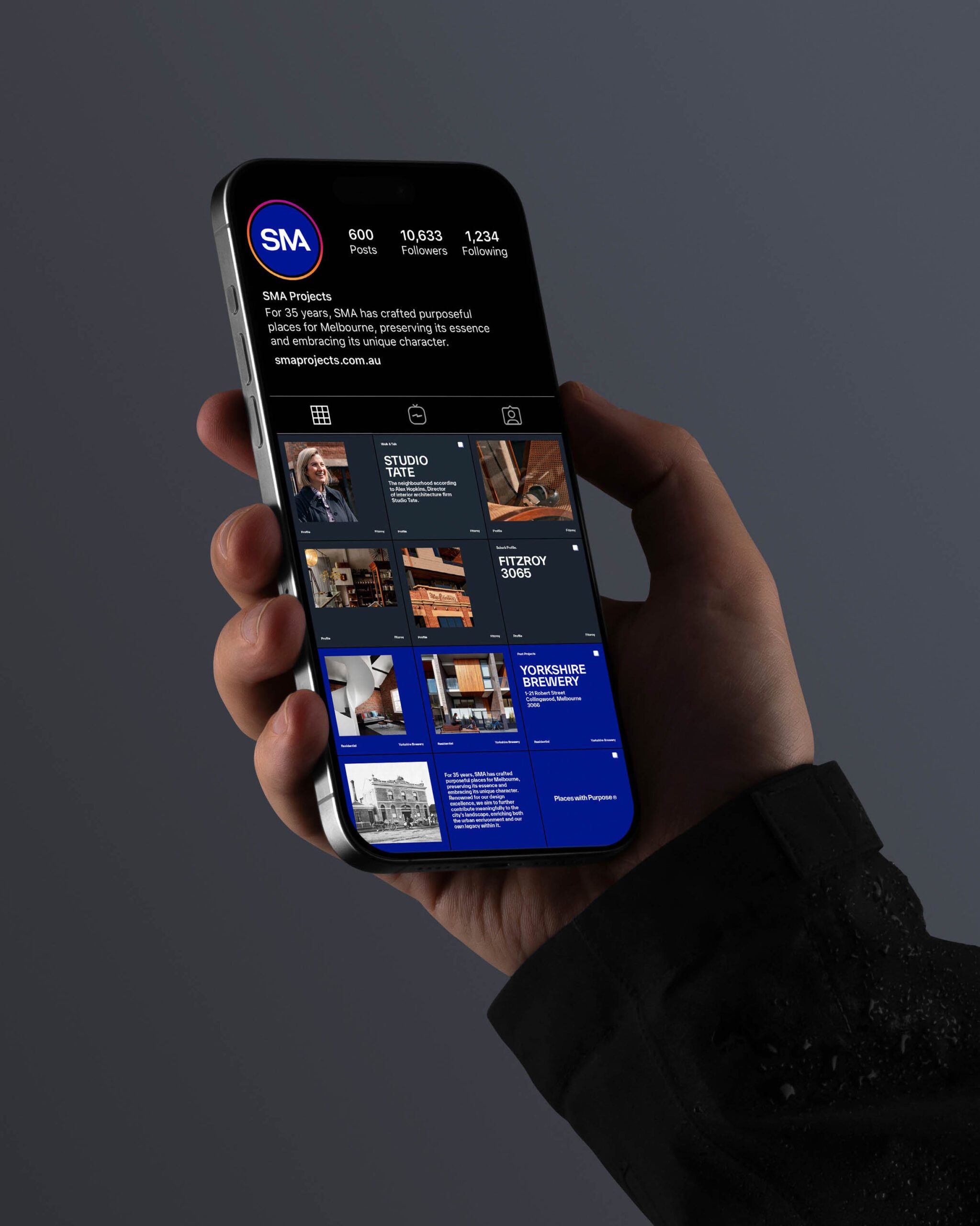
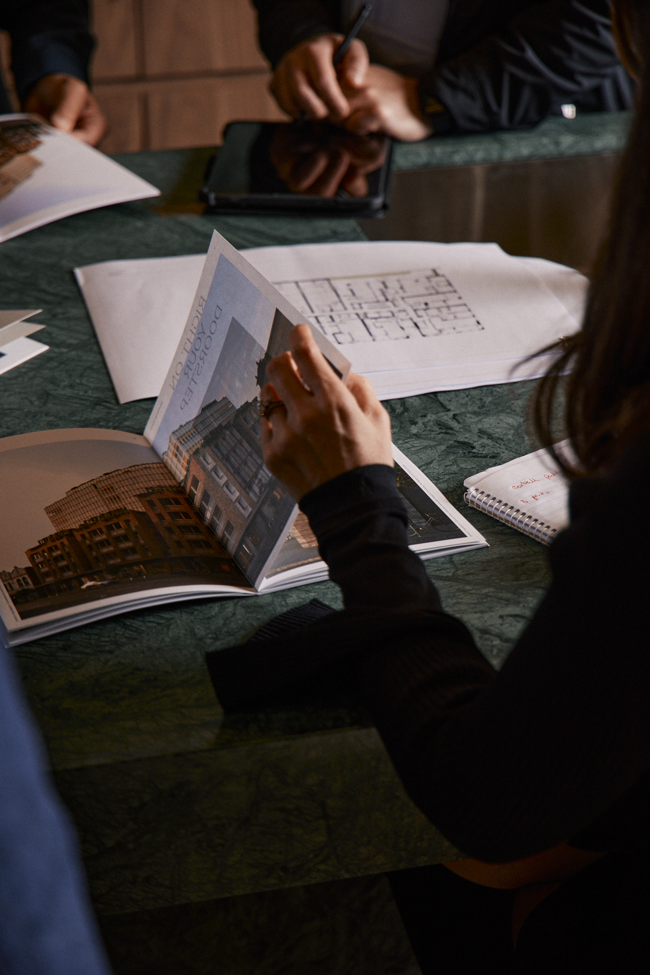
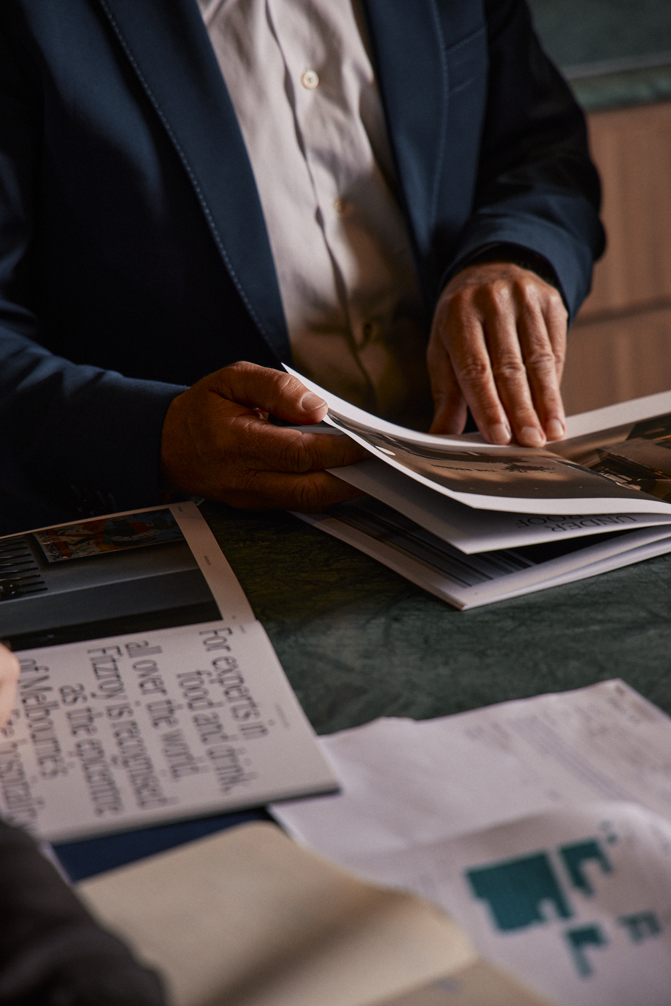
Branded signage was used strategically on-site to increase public visibility. Social media campaigns pushed audiences to the newly designed website, which served as the central hub for the brand’s story and offerings. Unified project marketing collateral further reinforced the SMA identity. Together, these elements created a consistent and recognisable brand presence — establishing SMA as a developer of substance, vision and credibility.
ART DIRECTION
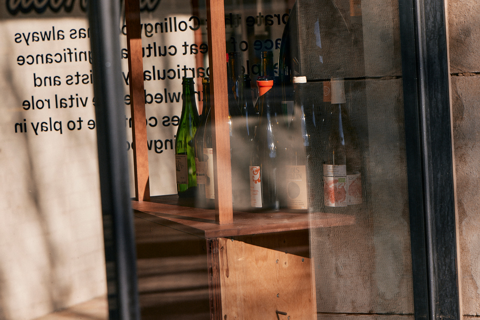
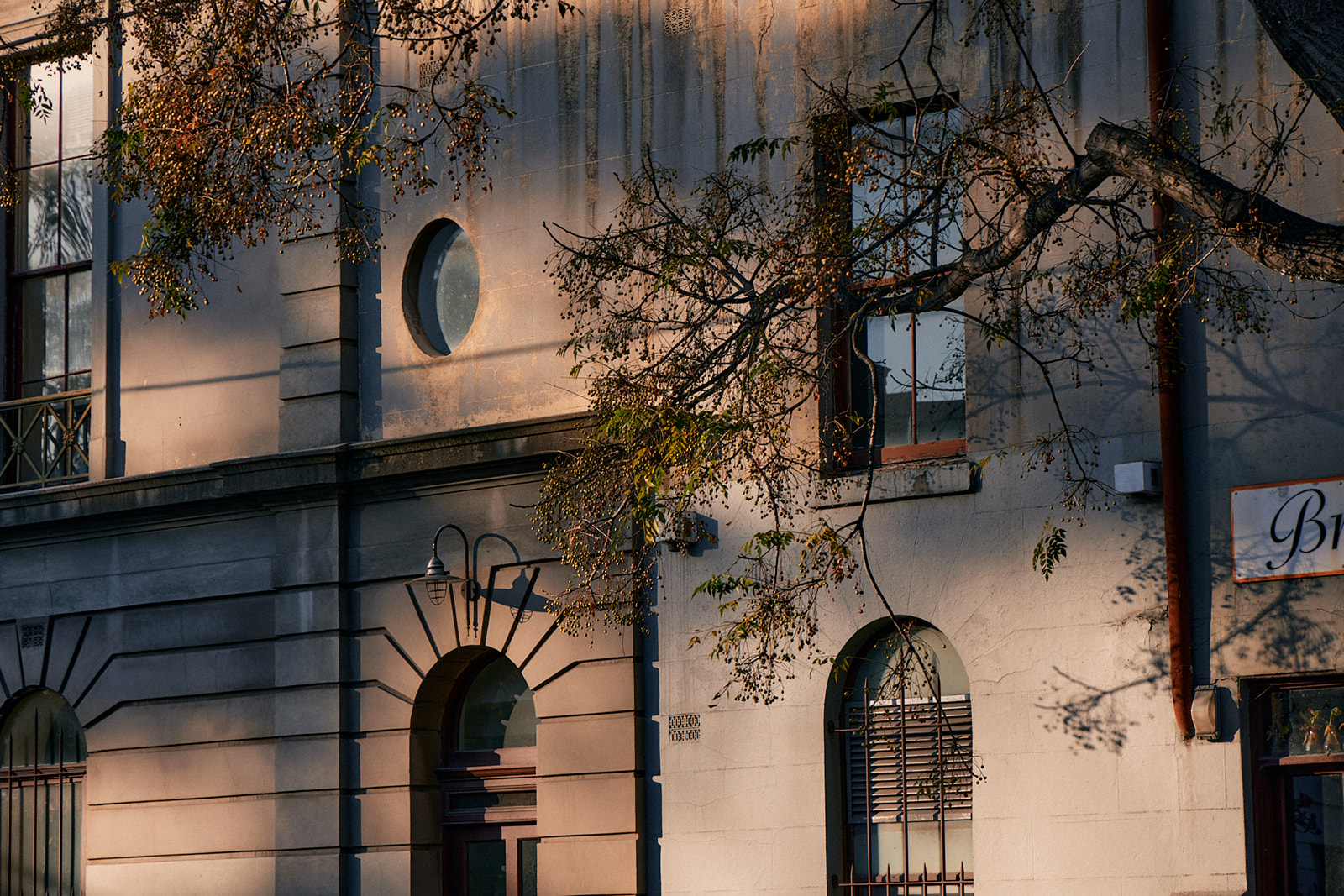
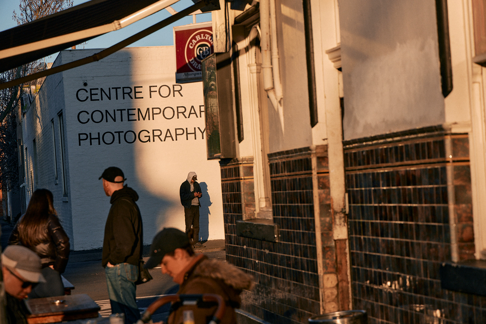
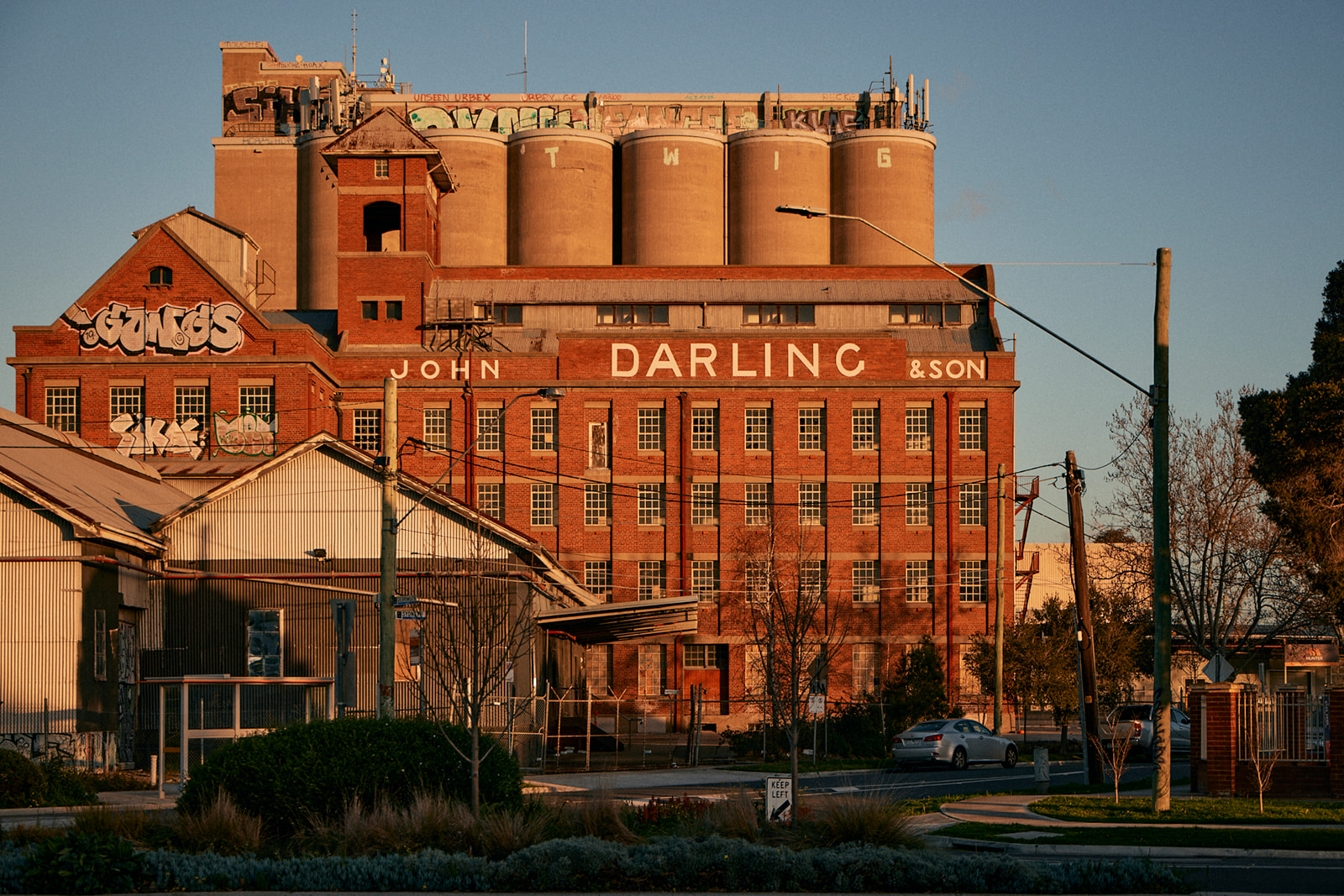
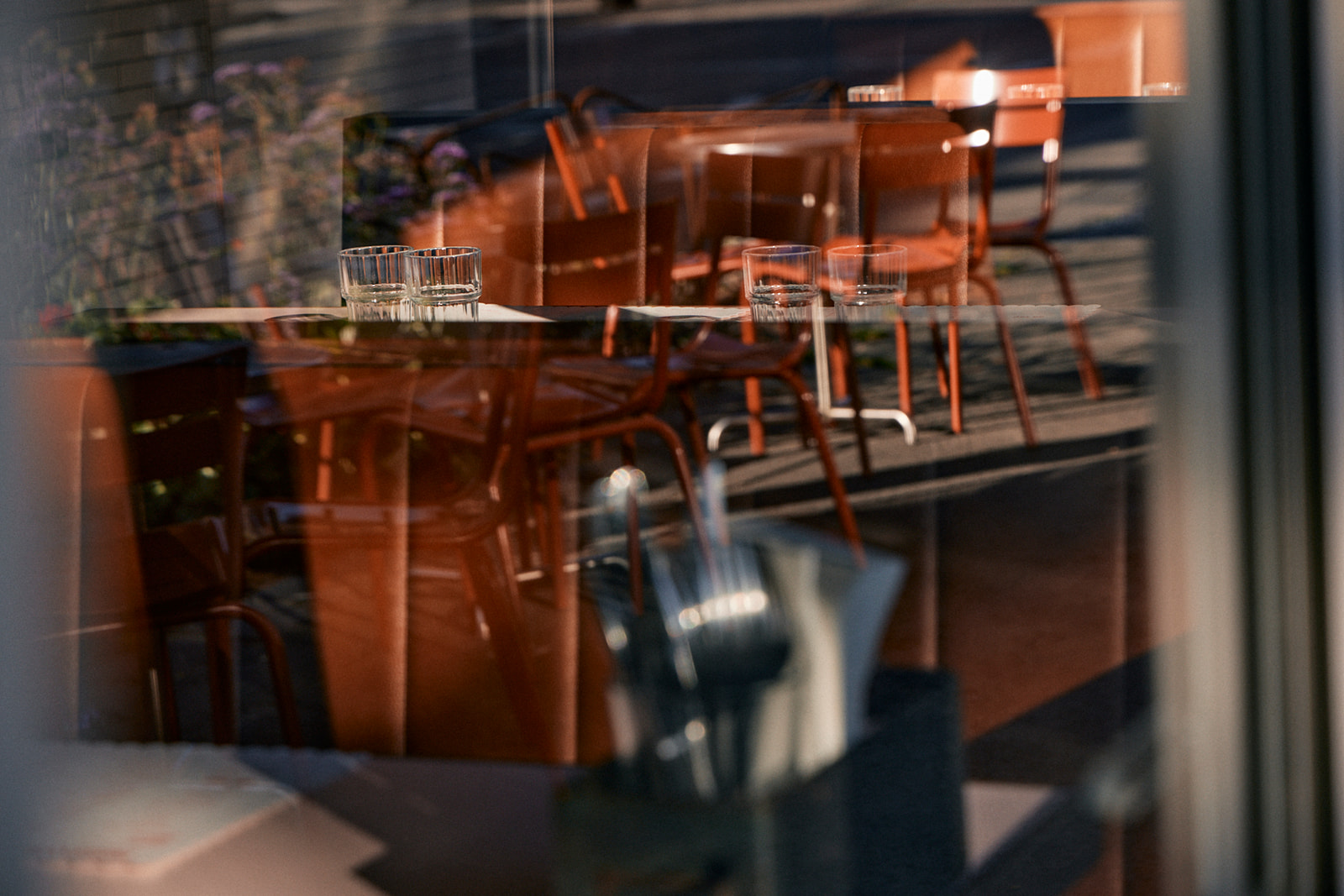
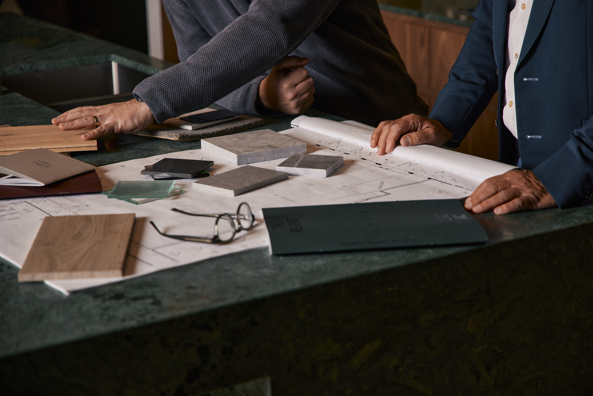
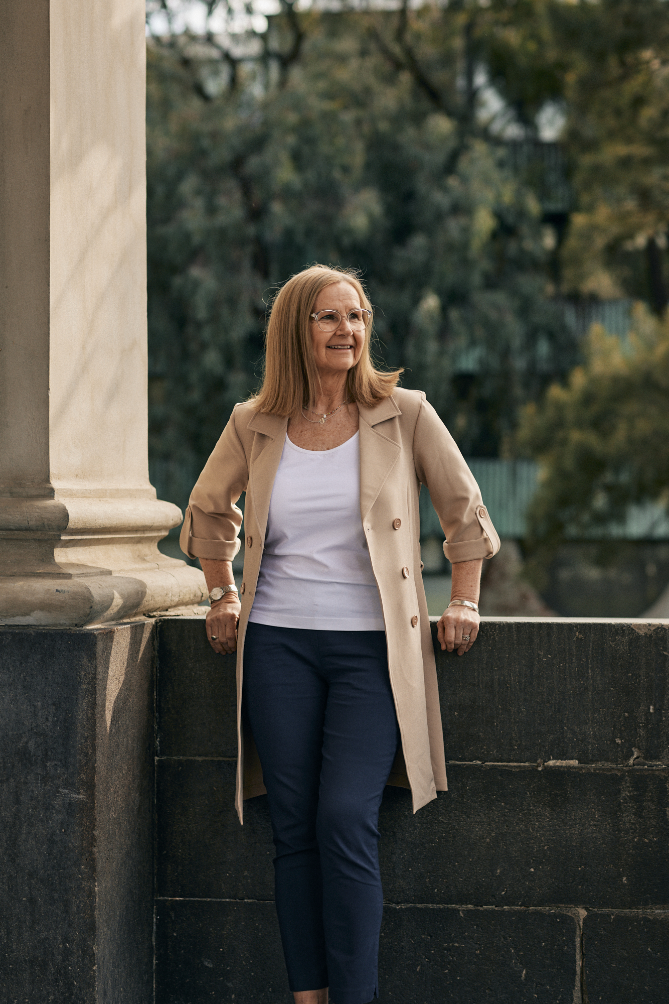
Our photographic direction focused on creating an authentic and place-sensitive visual language. We engaged photographer Emily Weaving for her ability to capture warm, natural light and honest, everyday moments — bringing a sense of humanity and place to the imagery.
Before launching projects to market, we conducted detailed location profiles for each suburb where SMA was developing. This approach allowed us to document the local character, reveal the cultural fabric of each neighbourhood, and align SMA’s developments with the spirit of place.
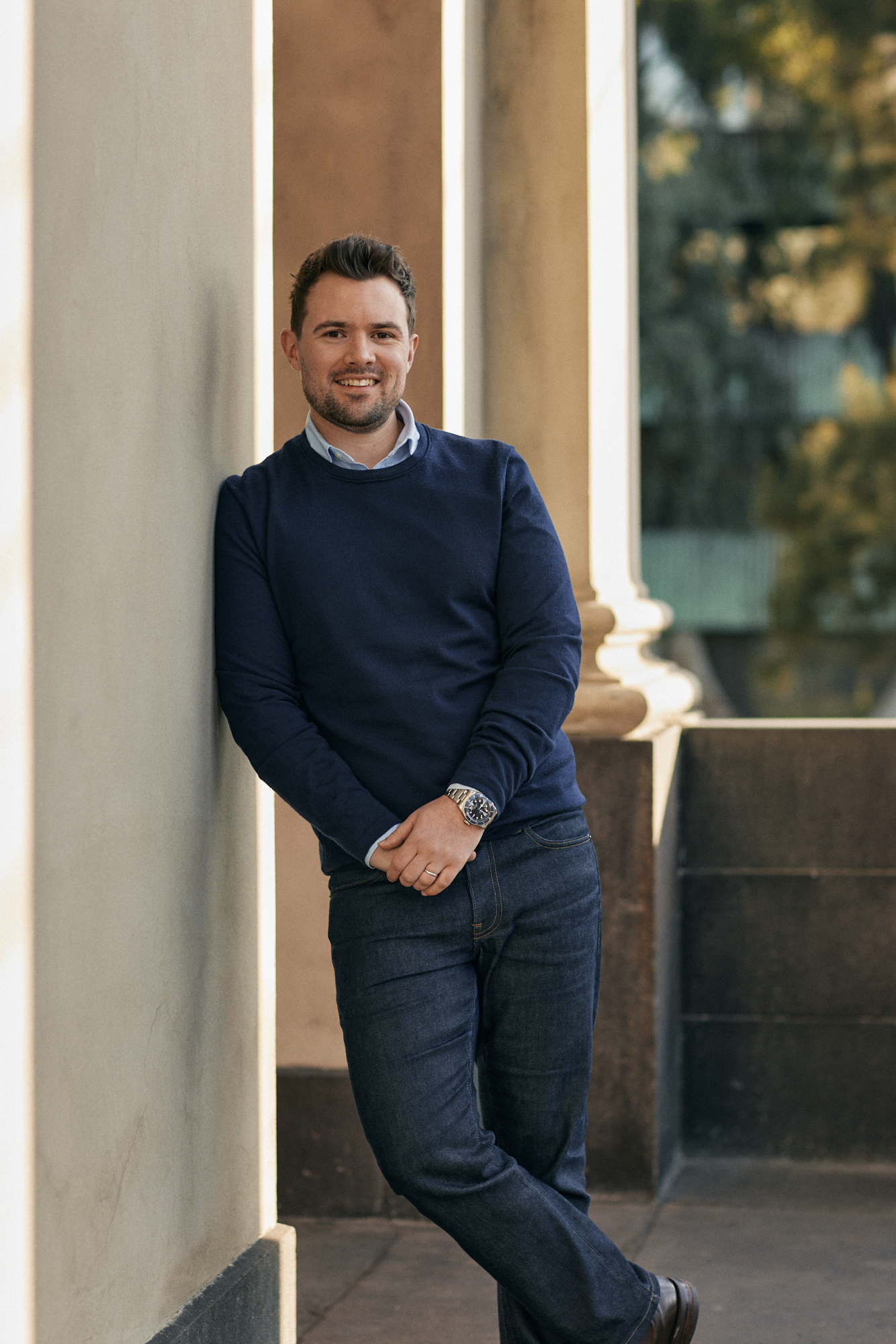
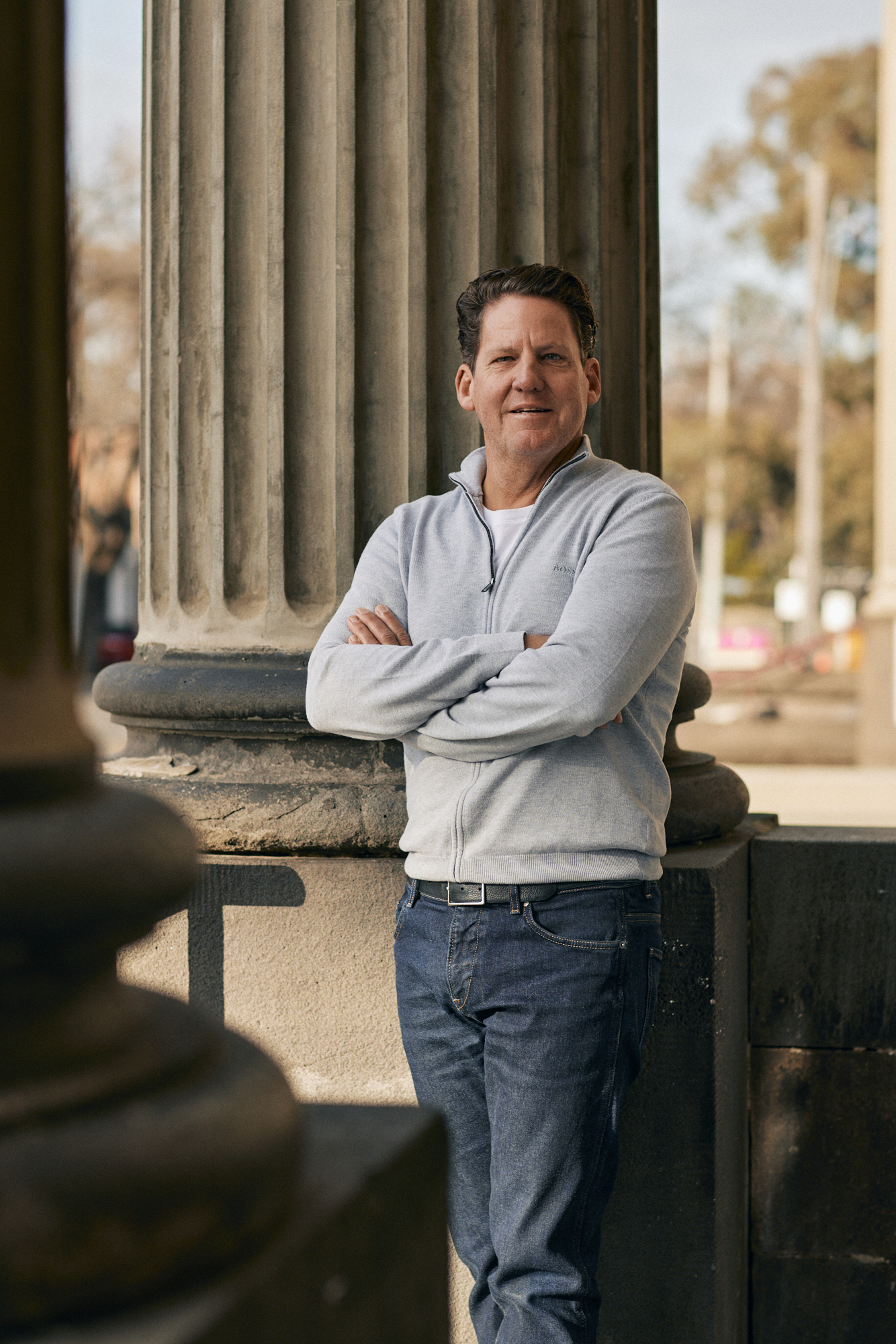
This process not only strengthened brand awareness but also reinforced SMA’s commitment to meaningful, culturally sensitive design. By pairing these suburb profiles with staff portraits and relaxed corporate imagery, we developed a cohesive image library that feels both professional and personal. The result is a collection of brand assets that reflect authenticity, community connection, and SMA’s deep respect for the places they shape.